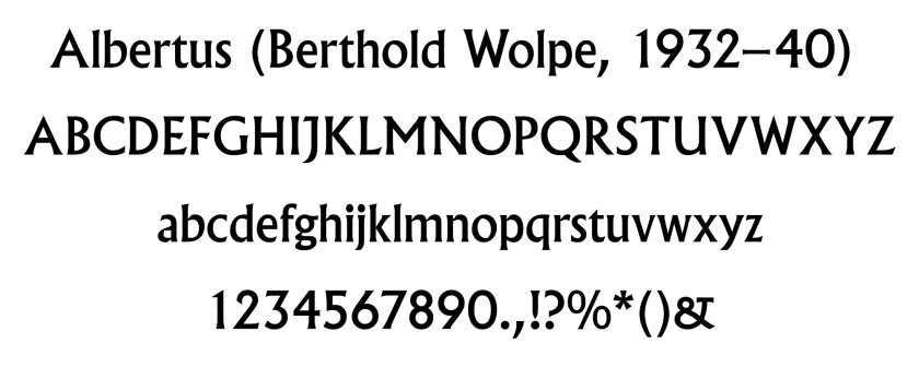
by Kurt Vonnegut, Jr.*
*obviously not by Kurt Vonnegut, Jr.
Note from John: I originally wrote this parody during my ill-spent grad school days while I was reading Melville for a 19th Century American Lit class, I think it was in 1993. I have revised it for this blog now in 2026. It’s probably only funny if you’ve already read Moby-Dick and about four or five novels by Kurt Vonnegut, so go ahead and do that first, I’ll wait.
For Nathaniel Hawthorne
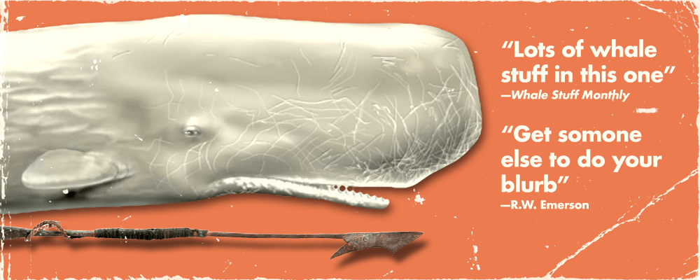
Dear Nate—here’s that short, jumbled, jangled book I was talking about the last time we got drunk together. It is short and jumbled and jangled, Natty, because there is nothing intelligent anyone can say about a big old off-white whale. Next time, I promise myself I will write a book about something fun, like a dolphin maybe. At least that could be optioned for a movie and make me some real scratch. The publisher said that they were going to get a fellow named Rockwell Kent to do the illustrations for this book, but Mr. Kent wisely declined. Instead, I have again taken my permanent marker and crapped out a few illustrations. To give you some idea of the level of maturity of my drawings for this book, here is my drawing of a whale:
And here, for no particular reason, is my drawing of the whale’s asshole:
Nate, there’s no doubt about it, I have written a wicked book. Bad, bad, bad. Shame on me. Yet somehow, I feel spotless. Like the lamb? Maybe. My book begins like this: Call me Ishmael. And it ends like this: Poo-tee-weet?
Loomings, foma & grandfalloons 1
Call me Ishmael. You might as well. Sometimes I spend the whole night drinking and smoking several packs of Pall Malls and singing sea chanteys until all hours, and then I end up going out to sea in a whale boat. I don’t know why I do this. My wife asks me, “Ish, what the hell were you thinking, going out to sea in a whale boat like that?” To which I reply: “Search me.” I think it must be damp, drizzly November in my soul, or else it is my hypos getting an upper hand of me. Whatever that means.
My wife scolds me and says, “Well, promise me this one thing: just don’t sign up with any crazy one-legged men this time.”
“Okay,” I say, but I always do.
A big kid with tattoos 2
So one day—never mind how long ago precisely—I found myself in New Bedford looking for a pub in which to ruin my liver. I was planning to ferry to Nantucket the next day and get a job on board a whaling ship. A whaling ship is a big wooden boat which is full of hairy uneducated men who drink lots of rum and sing sea-chanteys and chase whales. An example of a sea-chantey is:
Yo, ho, Pass th’ bottle and pass th’ gas,
Yo, ho, I be in luff wi’ a salty lass,
Yo, ho, She’s got all her teeth so she’s out o’ me class,
Yar, yar, yar, yar.
Yar yar yar yar yar hey!
(Repeat from the top for duration of voyage)
Which reminds me of another song, which goes like this:
Who’s the whale who bites off legs and then just swims away?
M, O, B, then there’s Y,
D, I, C and K.
A whale is a creature that lives in the sea and is six times as smart as the average person and looks like this:
The idea of whaling was for grown men who should know better to go out in a boat and stick a whale with pointy things until its lungs hemorrhage and it chokes on its own blood. Then the whale is chopped up into little pieces which are boiled down into whale oil which is put in barrels and sold for lamps and candles. Whale oil looks like this:
Can you believe I am actually getting paid for these illustrations?
Listen: The man in whose inn I stayed was named Petter Coffin. You get it—Coffin? You can’t buy symbolism like that. Anyway, he did not have a single room available, so he asked me if I would mind bunking with a cannibal. A cannibal is a person, male or female, who eats other people. I have nothing against cannibals, they are lovely people. My sister—bless her heart—married a cannibal. But I had to think hard about sleeping next to one.
Peter Coffin noticed my hesitance. “He doesn’t eat much at night,” he said. Peter Coffin had an enormous schlong, by the way.
“What the hell.” I said. I said it just like that: “What the hell.”
It turned out that I was sharing a bed with a big tattooed kid named Queequeg. He was just out of high school down in the South Seas and he was full of enthusiasm and missionaries, whom he liked served in a quiche. So it goes.
Queequeg had a dream that when all this whaling was over, he would move to Jersey and get a job in plastics. “Plastic is a young man’s game,” he said, fluffing me up like a pillow. “Big growth industry.”
“That’s great, Quee,” I said. I said it just like that: “that’s great.”
I thought, what I lovely kid to know what he wanted to do with his life so young. He smiled and fell asleep. Then he rolled on top of me and broke two of my ribs.
The prophet strikes 3
The next morning we left for Nantucket. On the way, Queequeg and I talked about a book that I had brought for the trip. Queequeg couldn’t read, literature being a low priority at his alma mater, Cookumup High. So I described the story: it was by my favorite author, Fillmore Sprout, and it was a really great book called The Scarlet Number. The story went like this: in the future everyone who commits a sin gets a big red number ‘666’ on their chest. But there aren’t enough numbers to go around, and everyone wants one. The heroine of the book, an alien named He-Star Prinn, sells numbers on the black market and then nobody has to sin for fashion anymore.
Well, now that I think about it, maybe it isn’t such a great book after all.
Queequeg told me to pick the ship we would hire up on. That was just the kind of kid he was. He had an enormous wang, too. I looked up and down the wharf and spotted a ship called the Pequod which lots of rats scurrying down the gangplank to the shore. “Let’s choose that one,” I said, “less rats.”
As we approached the boat we saw a man wearing a sandwich board that said things like ship of the damned and abandon all hope, ye who enter here and Ahab unfair to United Prophets Local 345. His name was Elijah, and he had bad wiring in his head. It programmed him to say things like: “Ar, me fine hearties. Have ye signed away your souls? Boo! Boo! Scary. Take heed, take heed.” Then he rattled some chains and opened a box of dry ice. “Watch out for Old Thunderer,” he added.
I had a dog once named Old Thunderer. He was a hell of a dog. I’d say it to my wife: “Old Thunderer was a hell of a dog.”
Knights and those guys that hang out with them 4
Listen: We cast out to sea for a five year vacation of whale-killing. So it goes.
The first mate of the Pequod was named Starbuck. At least, that’s what he wanted the crew to call him. “Boys,” he said, “call me Starbuck,” like that. He thought it made him sound like a dashing swashbuckler. But really he was just a poor slob like the rest of us, with a wife and kids who were never happy with him and a bad back and hemorrhoids. His real name was Leon Schwartz. Starbuck once told me an interesting thing. “Ish,” he said, “You might think the poop deck of a ship is where the head is. But it’s not. Trust me on this.”
The second mate of the Pequod was a fellow named Stubb. You might think that with a name like Stubb, he wouldn’t have a schvance, but he was actually hung like a bull. But when he was a boy he was picked on all the same. “Stubby,” kids would call him, “Stubb the grub.” Stubb collected stamps. His cabin was full of back issues of Philatelist’s Monthly.
I collected stamps, too, once.
The third mate was a ratty little man named Flask. Flask had become a whaler because he liked to stick sharp sticks into things. He liked to think that Starbuck, Stubb and himself were a team. “We’re the Three Musketeers,” he’d say. “We’ll give those whales hell, eh, boys?” The other mates would tie Flask up and then dunk him in the ocean using a long rope. “Some fun, eh guys?” Flask would sputter when they pulled him up. Then they would keep him underwater longer next time.
The three mates each had their own harpooners. It was as if the mates were knights and the harpooners were, well, those guys who used to hang out with knights. It’s not a perfect analogy. The harpooners’ names were Queequeg, Tashtego, and Dagoo. They were lovely people, just lovely. I used to ask them what it was like being savages.”Hours are good,” they’d say.
The harpooners all had their own special harpoons. All of these harpoons were kept in a special room. There was a hand-lettered sign next to them that said:
Whale stuff 5
Already we are boldly launched upon the deep. Or did I say that already? Sometimes I think that I, too, have bad wiring. But before we get to far into the story, let me digress into some bafflingly irrelevant tangents.
The study of whales is called cetology. This is from the Latin. It kills me that someone actually thought up a name for studying whales. I like to picture two guys sitting in a laboratory somewhere thinking up stuff like that. “Study of chinchillas,” one will say, and the other one will come up with something in Latin in no time flat. Then they laugh and go on to the next one: “Study of mothballs.”
There are lots of whales in the world. Some are big. Some aren’t so big.
When people are enjoying what they are doing, they might say, “Having a whale of a time,” but nobody knows why they say this. Whales don’t seem to be particularly happy to me, the way dogs do. But nobody says, “having a dog of a time.” The next time you’re out, just listen. I guarantee that you will never hear that sentence spoken.
You’d be surprised the number of books that have been written about whales. I once went to the library and got all the books I could get about whales and just looked at them. “Do people actually read all this stuff?” I asked the sub-sub-librarian. He belonged to that hopeless, sallow tribe which no wine of this world would ever warm.
He shrugged. “Search me,” he said.
What’s a quarter-deck ? 6
Listen: Captain Ahab came up on the quarter-deck.
Bad wiring? Don’t even get me started. Captain Ahab was the king of short-circuited thinking. He was angry and hairy and quarrelsome and peg-legged. He was also a fan of the author Fillmore Sprout. His favorite novel by Sprout was one called Uncle Tom’s Spaceship. It was the story of a man named Tom who had a spaceship. He worked for a cruel alien master as a field hand. But the law was once a year he got to be the master and the alien was the slave. Tom could run away in his spaceship whenever he wanted, but he never did, because he liked being master so much that one day a year.
Ahab called the crew together. He pulled out a gold coin and held it up in the sun. Gold is a heavy, yellow metal that is easy to bend and doesn’t tarnish. Because it is so bright and shiny, grown men who should know better kill each other to have it.
So it goes.
Ahab took that coin and hammered it onto the mast. The hammer he used, by the way, was a ball-peen hammer, which was invented by my great-grandfather in Warwick, England, exactly 100 years ago in 1751. Small world, as they say.
Ahab said: “Whosoever of ye raises me an off-white-headed whale with a wrinkled brow and a crooked jaw—look ye, whosoever raises me that same off-white whale, he shall have this gold ounce.” He said it just like that. Reading too many Fillmore Sprout novels had turned his brains to peet moss and made him talk silly.
The whale Ahab was talking about was called Moby-Dick. A few months ago this whale had made a snack of Ahab’s left leg. So if anyone should have been named Stubb, it should have been Ahab. You might think that losing a leg would mellow a man, cause him to reconsider his priorities and take up shuffleboard, but not Ahab.
Personally, I love shuffleboard.
“Who’s with me?” shouted Ahab.”Huzzah!” the men shouted right back, except for Starbuck. Starbuck was not sure he wanted to spend his time looking for an off-white whale, and he said so.
Listen: To provide some stylistic variety, here is my little play of what happened next.
[enter Starbuck, looking concerned]
Starbuck: I was just thinking, it’s kind of a big ocean and all…
Ahab [waxing grandiloquent]: All visible objects, man are but pasteboard masks.
Crew: Huzzah!
Starbuck: What?
Ahab: The Pagan leopards—the unrecking and unworshipping things, that live; and seek, and give no reasons for the torrid life they feel!
Starbuck: Huh?
Crew: Huzzah!
Ahab: [aside] Now I have Starbuck!
Starbuck: Who are you talking to over there?
Anyway, the point I am trying to make is that eventually everybody agreed to hunt Moby-Dick until the whale was made into candles. So it goes.
The off-whiteness of the whale 7
What was it about an off-white whale that so unnerved Ahab? That made him want to stick Moby-Dick with sharp sticks so badly? One answer lay in another book by Fillmore Sprout, The Slightly Yellow Wallpaper. The story took place on a planet called Ecru. On the planet Ecru everyone decorated in off-white designer colors with names like “cream,” “mushroom,” “September mist,” and so forth. But no one used plain white. Eventually the colors became so subtle that the aliens of the planet Ecru could no longer find chips to match their bedroom walls, no matter how many hardware stores they visited.
Is it this bland decadence that so terrifies the soul? The way off-white contains every color, plus a little something extra to warm it up? The nondescriptness of a color like “putty” which is so vague that it makes everything seem meaningless? What kind of a person would paint their bathroom walls “oatmeal” anyway?
Besides my brother-in-law, I mean.
Oh, by the way, around this time Queequeg got sick and thought he was going to die. So he had a coffin made for himself. This last bit might seem like an irrelevant thing to mention, but I have to set up the device somewhere for a big payoff at the end of this story.
A paper clip 8
Look: It also occurs to me that it has been a few pages since I drew one of my crappy little pictures. So here is one, of a paper clip that was in my pocket during the voyage:
The best thing is, Delacorte Press has to print all of these doodles. They have no choice, it’s in my contract.
Chasing the whale 9
A lot of stuff happened on that trip, but I decided to leave it out of the book. An old man like me has to pace himself. So let us skip ahead to the end of this thing. From this point in the story I will reuse a gimmick from one of my lesser-known books: I will place an asterisk (*) after the name of any character who will die within the next twenty-four hours. Like I said, I am an old, drunk fart—I can’t be expected to come up with brand-new devices for all my novels.
Look: there is Ahab*, pacing around again. He is about to give up his search.
Ahab* said, “What is it, what nameless, inscrutable, unearthly thing is it, what, cozzening, hidden lord and master, and cruel, remorseless emperor commands me? Is Ahab*, Ahab*? Is it I*, God, or who that lifts this arm? Hey, isn’t that Moby-Dick over there? Well I’ll be keelhauled.”
Ahab* ordered the crew* to man the harpoon boats. They were just kids on a crazy crusade. They had no particular desire to go and stick a whale full of sticks.
I have instructed my children that they are under no circumstances to stick a whale full of sticks, and that the news of a whale stuck full of sticks is not to fill them with pleasure.
Ahab* manned a boat with the rest of them*. It made him feel important, to be hands-on that way. I was one of the rowers as we set off after the off-white whale. My back ached. All of our backs ached. “Don’t worry, men,” Ahab* said to us. “My counselor, the wretched Fedellah* has prophesied for me that I cannot die until I meet a deaf Swede who is five foot two.”
“I’m sorry, what was that?” said “Shorty” Ingmar*, sitting beside me and cupping his ear.
At that moment Moby-Dick breached, turned, and sped towards the Pequod. He was fearless. He had no asterisk behind his name. With a crash he rammed the ship and it split in two and began to sink. The water beneath it bubbled and swirled into a whirlpool.
“I’ve seen worse,” said Ahab*, shrugging. Then shouted to the whale: “To the last I grapple with thee; from hell’s heart I stab at thee; for hate’s sake—”
With a chomp Moby-Dick swallowed Ahab* and broke the harpoon boat in two. The whale was tired of listening to him go on and on in that dumb pirate dialect, or whatever you would call it. Everyone else* sank into the ocean.
Almost everyone. Up from the whirlpool popped Queequeg’s coffin, and I grabbed a hold of that thing and held on for dear life. His coffin. You get it? It was Queequeg’s coffin, but it saved my life. Irony. I tell you. That’s damn fine writing.
A bird 10
The sea rolled on as it rolled five thousand years ago. Above, the sky was a brilliant blue. It was really kind of pretty, if you overlooked everybody dying horribly and all that. But the massacre was over now. A few yards away from me, a little bit of the main-truck of the Pequod was still sticking out of the water. Tashtego was nailing a flag to it? For some reason? Look, the important thing was he chose to spend his last minutes on earth doing cosmetic repairs to a rapidly sinking ship.
There was a sky-hawk hovering near the crow’s nest and he swooped down to perch on it, only to find that he’d gotten one of his wings nailed to the mast by Tashtego.
It said, “Poo-tee-weet?”