Never the same game twice

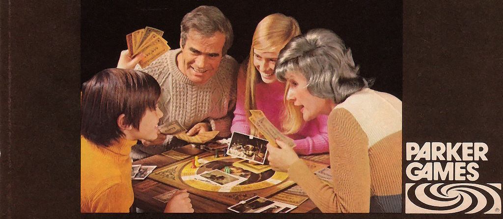
My last essay was a critique of nostalgia, and so to mix things up this post will be a discussion of something from my youth for which I have a great deal of affection, and that is Parker Brothers graphic design from the 1970s. This is admittedly a niche interest, even for me, but I hope you’ll be indulgent. Perhaps you, too, will come to love these beautiful and strange designs.

From around 1970 to 1980, the Salem, Massachusetts-based Parker Brothers (now a brand of Hasbro) published games whose innovative and fanciful designs drew inspiration from Pop Art, Op Art, and Madison Avenue advertising. They had boxes, boards, and components that reflected the most current techniques of printing and plastics molding. They were witty, silly, and weird. The other main players in American games at the time were Milton-Bradley, whose art tended towards cartoony, corny, and flat designs, and Ideal, whose games (like Mousetrap) were mostly showcases for their novel plastic components.

Parker Brothers design stood out for its style and sophistication, and even as a young nerd I could see that it was special. In fact, I believe they were my introduction, at the age of seven, to the whole concept of graphic design. This isn’t to say that the games were good in the sense of being fun or engaging to play; a lot of them were re-skinned versions of the basic race-around-the-board type that had been popular since the Uncle Wiggly Game. But they looked amazing and they were different.

There’s not a lot of sources of information about the company, but there is one very interesting book, The Game Makers : the Story of Parker Brothers from Tiddledy Winks to Trivial Pursuit, which was written by Philip Orbanes in 2004 and published by Harvard Business School Press. From this book I learned that starting with its founding in 1883, Parker Brothers was a family owned operation, and its ethos was decidedly conservative. It produced child-friendly tabletop games that it purchased from independent creators, with little to no research and development and with a small factory that printed simple boards and boxes and made components from simple materials.

Along the way they picked up some major properties, like Monopoly and Cluedo, which was rebranded in America as Clue, but they didn’t develop these in-house and they didn’t really have a marketing strategy of any kind. But all that changed in 1968 when the company was sold to General Mills—yes, that General Mills, of Cheerios fame. After the departure of one president who wanted to cash out and retire, and the death of another who died of lung cancer, executive vice president Ranny Barton took the helm, and he immediately replaced the head of manufacturing and the head of sales. Orbanes writes:

In one fell swoop, Ranny Barton had changed Parker Brothers from a family-run, conservative operation to one now seeking high-flying M.B.A;s and marketing wizards in a quest to again double sales. Ranny […] would oversee a group of executives who were experts (165-166).

For the first time, the company had project leaders and marketing staff (largely on loan from General Mills). They brought in professionals in design, production, and printing. They bought a new state-of-the art press capable of much finer detail and vibrant colors, and they switched to making their components out of injection molded plastic. They were out to compete, and that meant to advertise on the new medium of television, and to be distinctive.

Okay, that’s more than enough backstory. Let’s look at some of the games from this time.

Waterworks (1972)

Waterworks

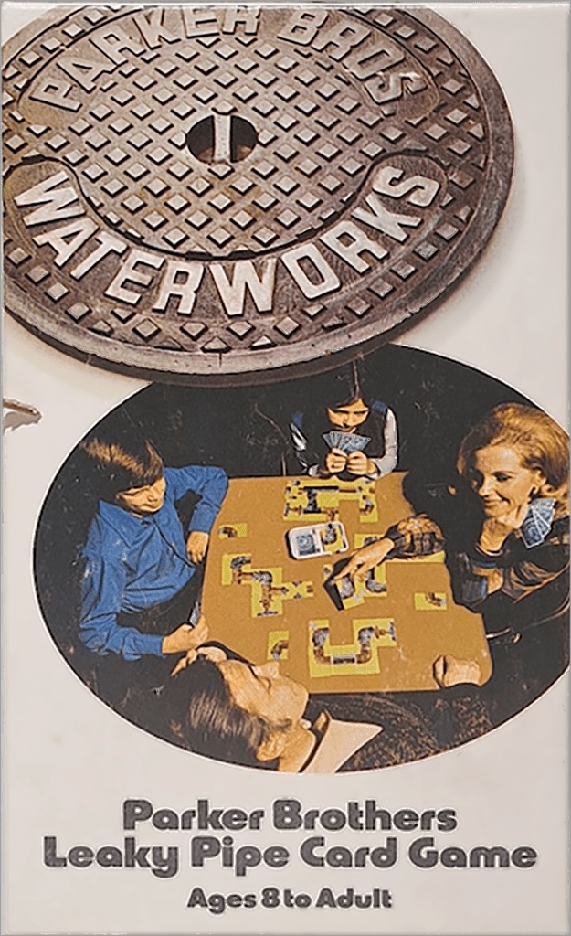
I remember coming across a used copy of this game at a school tag sale when I was in first grade. It looked like nothing else I’d ever seen. The cover art was sparse and focused on its photography. The text was set in Blippo, which seemed shockingly futuristic (it was actually designed in 1969). Most of all, the diegetic title on the manhole cover felt absolutely tangible. I splurged on the 30-cent purchase (my allowance at the time was a quarter).

Waterworks
Waterworks

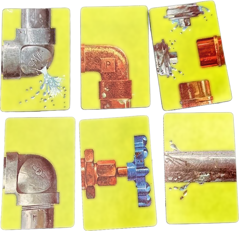
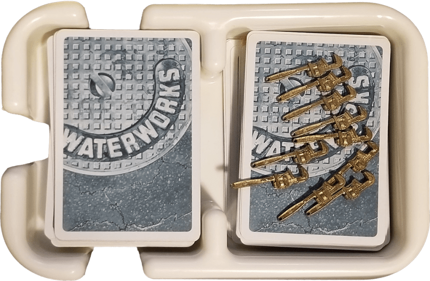
Inside, the cards were wonderful, featuring detailed, photorealistic depictions of pipe fittings, handles, and spouts. They came in a draw/discard bathtub. And there were tiny brass monkey wrenches (perhaps using the existing Clue wrench molds). Everything was designed to be tactile and engaging.

Waterworks was designed by Mattiene Moustakas, although whether she designed the gameplay and components, or illustrated the cards, or both, is unclear. She certainly has a crazy resume. As for the play, a modern gamer will recognize it as a tile placing game such as Carcassonne; one chained one’s cards together to make a line from handle to spout, while playing pipe junctions and leaks on the opponent’s spread. It was…ok. It was certainly different from the card games I’d played, which were basically War and Solitaire1.

The Inventors (1974)

The Inventors

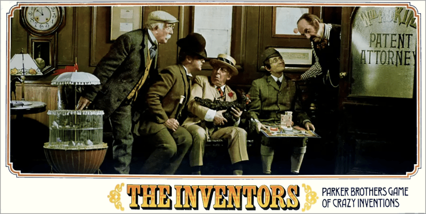
I’ve mentioned before that the 1970s had a strange retro fad for “old-timey” things, by which I mean Americana from about 1890 to 1905. I am at a loss to explain this. It was a time of serious social problems, from race relations to stagflation. Perhaps there was a longing for a mythical past. The counterculture had drawn heavily on Art Nouveau in poster design, and maybe this trend was breaking into the wider culture. In any case, The Inventors was themed around patenting odd Victorian-looking inventions. The cover art was a highly staged studio shot with models in costumes with props. It featured many of the gadgets referenced in the game, as well as an inventor holding the game itself on his lap, and that kind of self-referentiality was catnip for me. (By the way, the text on the bottom right is in a typeface called Desdemona, which originated in Vienna and has always sounds drama club to me.)

The Inventors

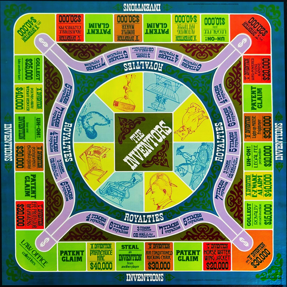
The board features a pastiche of Victorian typography and day-glo colors. It features two different tracks to circle the board, but the filigrees and other ornamentation make it seem much more complex. There are handsome cards that feature descriptions of the various inventions to be patented. But the real star of the show is the centerpiece, “the incredible patent picker, move maker machine.”

The Inventors

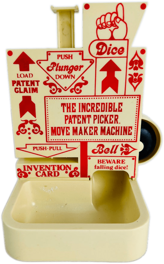
This chunky bad boy held the metal clip-on numbers that were the game’s patents, and the “push-pull” dispenser never really worked because the invention cards would bend and fray when you stuck them in. But that didn’t matter, because the real attraction was the dice chute. You placed the dice into the hopper and hit a plunger and they would roll into the tub below, all while ringing a bell.

The Inventors was designed by Jeffrey Breslow, who was a student of Marvin Glass, a powerhouse designer that has created many of the most recognizable toys of the 20th century. Breslow, working with Glass, also designed Ants in the Pants. As for The Inventors’ gameplay: meh. It vaguely resembles Monopoly in that players attempt to succeed financially by developing their properties. But for the most part it’s circling the board in parallel to one’s opponents, with perishingly few actions that directly affect the other players.

The Magnificent Race (1975)

The Magnificent Race

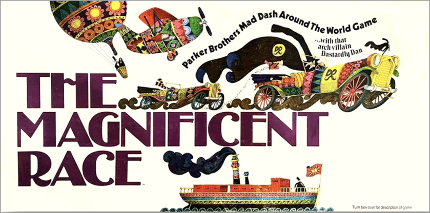
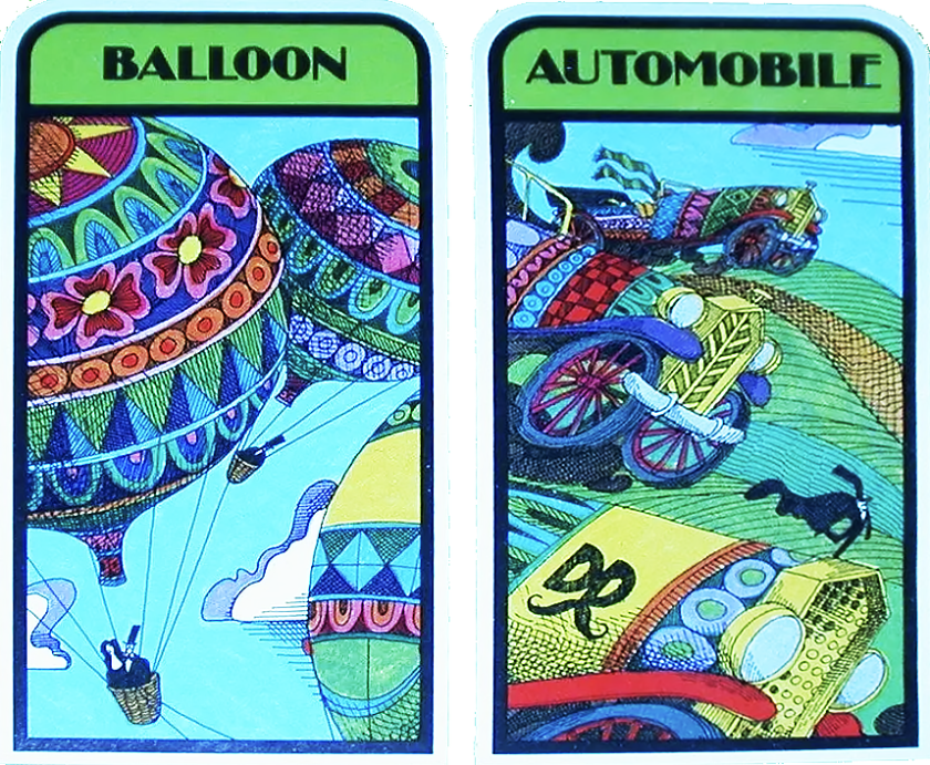
Another old-timey game, The Magnificent Race obviously takes inspiration from Jules Verne’s Around the World in 80 Days. The players must circumnavigate the globe using cars, ships, planes, and balloons. The gimmick of the game is a non-player-character (before there even were NPCs) called Dastardly Dan, represented by a purple marble, who can interfere in, and even win, the titular race.

The game’s board shares its typography, color palette, and even curvilinear forms with the Inventors’ board, and I’m pretty sure the same designer did both. One innovation to this board is the paths are not directional, and players may move there arrows in any direction. This may not seem like a particularly distinctive feature today, but it was unusual in 1975.

The Magnificent Race

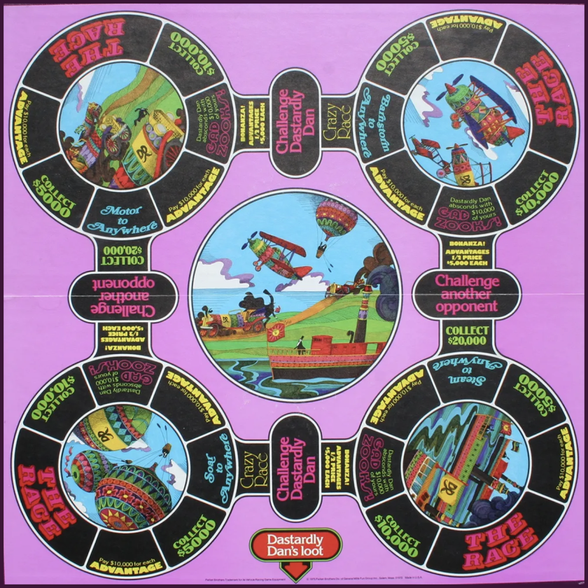
The components here pull out all the stops. There are big chunky arrows used as player markers, layout cards on which to place “advantages,” a pegboard to track overall progress around the world, and a spinner with colored marbles (including Dastardly Dan) that determines the winner of each of the series of small races that make up the game. Each player drops in a number of marbles based upon their advantages, the device is spun, and the first to drop into a divot near the center wins.

The Magnificent Race

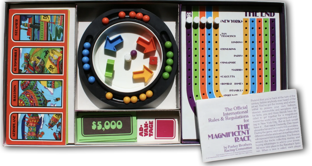
When everything is set up it’s pretty impressive. Fun fact: the groovy fake money for the game is printed on green and purple paper that isn’t shelf-stable. I know this because the bills in the copy I purchased for my kids many decades later crumble apart at the slightest touch.

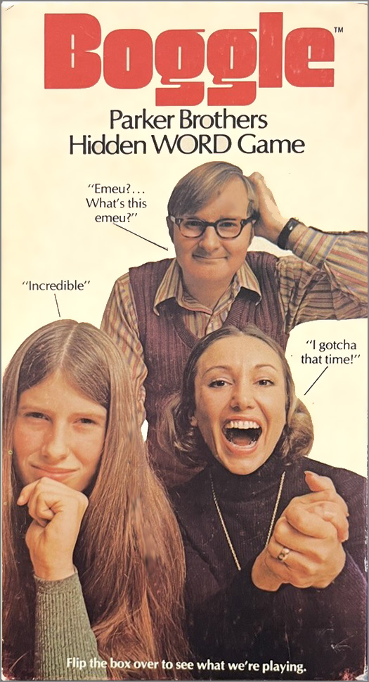
The game was designed by Bill Cooke, who co-designed Boggle (also originally published by Parker Brothers). On his Facebook page Cooke has photos including the original schematic drawings for the spinner. But for me the real attraction is the scratchy, cartoony pen drawings, which recall some of the more elaborate designs of Milton Glaser. I would dearly love to know who the illustrator was for these.

The Magnificent Race

As for the gameplay…this one’s a real let-down. All of the bells and whistles can’t hide that at its core it’s a random chase around the board. However, the spinner is a lot of fun, especially when the Dastardly Dan marble wins.

Bonkers (1978)

Bonkers

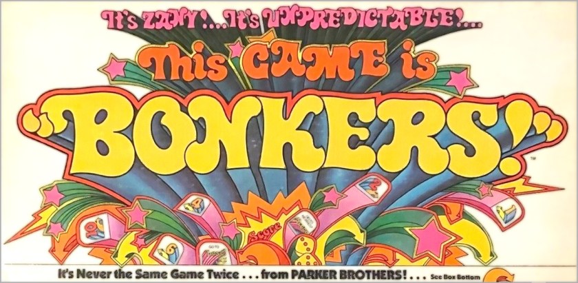
Or to refer to it by its full name as printed on the box, This Game is Bonkers. This was not a game my family owned but I played it at friends’ houses and it had an earworm-y television commercial that probably most Americans in their 50s can still sing today.

Bonkers

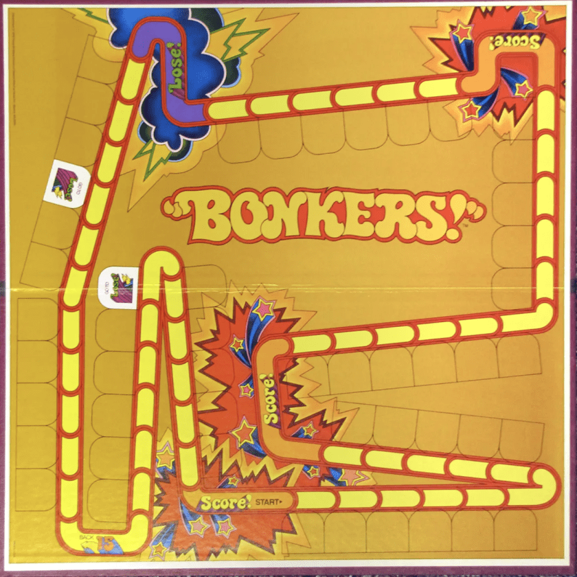
In the Bonkers graphic design Parker Brothers reached an apotheosis. For years they had been cribbing from the cheekier parts of Madison Avenue; here they went full-on Peter Max with shooting stars, lightning bolts, volumetric arrows, and exclamation points everywhere. The board starts pretty empty, but players fill in the spaces with U-shaped cards that change the flow of movement, directing tokens forwards and backwards and eventually into spaces that score or remove points.

Bonkers

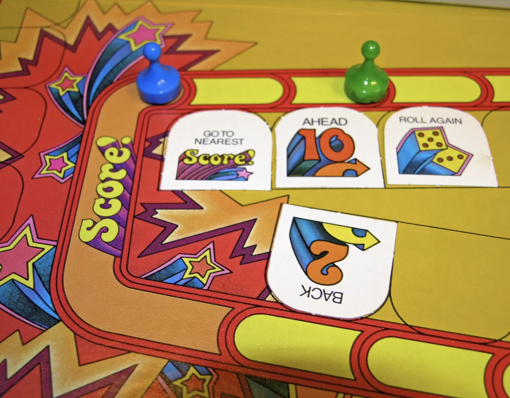
The design couldn’t be more frenetic or bold. Unfortunately, the graphics promise a zanier time than the gameplay delivers. The mechanic of players altering the rules of the game as they go is a good one (see modern games like Fluxx), but that’s not really what’s happening here; instead, the normal clockwise race around the board is being lengthened by digressions. It’s still a fixed track. But man, does it look great.

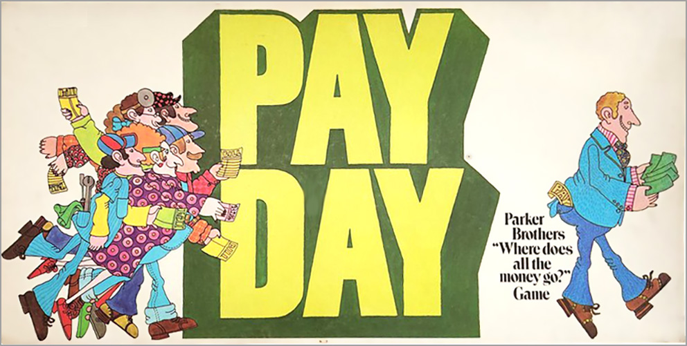
Bonkers was designed by local boy Paul J. Gruen, who lived in West Newbury, just a half-hour drive from Parker Brothers. He also designed Pay Day (1972) for Parker Brothers, another game whose original graphics had pop art origins—in this case with illustrations resembling those of Heinz Edelmann, character designer for the Beatles’ Yellow Submarine (1968).

Pay Day

That’s enough

I could go on for hours, and it probably feels like I have already. There’s so many wonderful designs from this period: Vertigo (1970), Masterpiece (1970), 10-Four Good Buddy (1976), The Mad Magazine Game (1979). Even the original Boggle (1973) cover art is a crazy snapshot of a time of weird innovation: it didn’t actually feature the game2.

Boggle

As the 70s ended, Parker Brothers swung heavily into electronics with toys like Merlin (1978) and their own line of cartridges for the Atari 2600. And in 1985, General Mills merged the company with Kenner, then sold it to Tonka in 1987, before everything eventually got bought up by Hasbro in 1991. But for a brief time in the 70s, Parker Brothers was the one game company that was distinctive, brassy, different. The games themselves were hit-or-miss, but the design always landed.


  1. As an aside, I learned the version of Solitaire I knew from my mom, which was a hard-as-nails version that I have never seen anyone else play, so I don’t even know what it would be called. Years later I would learn that most kids played Klondike, which I would scoff at as a baby game. ↩︎
  2. Also it was set in Optima! ↩︎

Less Fun than a Barrel of Crackers

Header image: S.O. Grimes general store, Westminster, Md., c. 1900. Image via Library of Congress.

Another day, another shot fired in the culture wars: this time, the internet is losing its collective mind over the new logo for Cracker Barrel. If you are unaware of the controversy, congratulations—you might consider skipping reading the rest of this essay to remain in blissful ignorance.

To summarize: Cracker Barrel, that paragon of blandly inoffensive roadside dining, has decided that its long-standing theming to evoke early 20th century general stores might be limiting its appeal to Gen Z, and so has embarked on a brand makeover that downplays the hokey country charm. Part of this rebrand is a simplified logo that ditches an illustration depicting a gentleman in overalls perched on a wicker seat ladder back chair and leaning against the titular barrel. (This man, “Uncle Herschel,” was a real person.)

Cracker Barrel logos
Cracker Barrel logos, left: 1977, right: 2025.

To say that the change has not been taken well by the chain-restaurant-going public would be an understatement. Some of those seeing red also see a political conspiracy—from “influencers” who say that the logo is stripping culture and heritage away from rural white Americans, to Fox News hosts claiming that corporate moves such as this logo change are why President Trump needs to send troops to Chicago. Underlying these criticisms is the assumption that the rebrand is part of an insidious “woke” movement perpetrated by American businesses.

The truth is, no corporation wants to touch anything political with a twelve-foot pole, especially these days. Look at what happened to the department store Target, which caught flack from the right for daring to stock pride merchandise, only to get hit even harder from the left for caving to anti-DEI pressure. Walmart and Amazon have also been subject to boycotting headaches over DEI policies and allegations of abetting the Trump administration. No, politics have nothing to do with the decision to change the Cracker Barrel logo—although it remains to be seen if political outrage from consumers can be sustained.1

The rebrand reminds me of a similar kerfuffle last year involving the British confection Lyle’s Golden Syrup. Americans may be confused that such a product exists in the first place; but they would be even more baffled by the logo for the sugar refinery Abram Lyle & Sons, which consists of bees swarming about the corpse of a lion. The company’s motto, “Out of the strong came forth sweetness” points to the source of this imagery, the biblical tale of Samson’s riddle2. All of which is to say that this is the most badass logo ever, as well as being an amazingly long-lived one—it dates to 1883. In 2024, Lyle & Sons decided that this work of art was too morbid, and replaced it with a more anodyne illustration of a syrupy lion. This change was also greeted with political accusations.

Golden Syrup
Lyle’s Golden Syrup rebrand. Original design on left, 1883; new design on right, 2024.

But just because I doubt that these choices were motivated by politics doesn’t mean the detractors don’t have a point: something basic is being lost here. In both cases the companies have discarded character and context in an effort to streamline their identity. I have written previously about the often misguided penchant art directors have towards simplifying their brands. I suspect that the lion’s share (ha) of this tendency is simply following trends, and the current fashion in corporate design is simple, flat typography and short (often single-word) brand names. To the extent that someone actually gave this a thought, the rationale is to remove any attributes that might complicate a consumer’s attitude towards the brand. It also reflects the desire of new executives to mark their territory by peeing on it—see HBO’s constant rebranding, or Elon Musk destroying the only part of Twitter that had any value, its name recognition.

If you want to be charitable, and I try to be when I can, the move towards brand simplification also reflects a longstanding adage in design—be it visual art, design, writing, or engineering: “less is more.” This saying, often misattributed to Mies van der Rohe, emphasizes clarity and utility. The goal is to focus on what is essential. Practitioners of this belief make outsized claims about the effects of this approach. In his seminal work Understanding Comics (1993), cartoonist Scott McCloud claims that idiographic drawings amplify meaning. He also claims that in simplified, “cartoony” design, viewers can insert themselves into the depiction3. I love McCloud to pieces but this all seems a bit farfetched to me.

McCloud
Scott McCloud claims that simplification leads to self-identification. Understanding Comics, 1993.

There’s a lot to be said for purposeful simplicity. Growing up in the 70s and 80s I was surrounded by, and loved, logos by Saul Bass, Milton Glaser, and Paul Rand, all of whom were known for absolutely iconic, geometric, minimalist designs. But these artists, working before digital tools, had to visualize their designs as tight, abstract forms. They did not select something they liked from the font menu, slap it on a generic color shape, shut down Adobe Illustrator and call it a day. Even at their simplest, the great Modernist graphic designers had a sense of context and of play. They weren’t afraid of their work conveying an attitude.

logos
Logos by Saul Bass (left), Milton Glaser (center), and Paul Rand (right)

And it’s attitude that’s missing from the Cracker Barrel rebrand. The original logo wasn’t great, in much the same way that the actual restaurants aren’t great. But it did have a point of view, and that’s what the new design is lacking. As a rule of thumb, good design is supposed to not draw more attention than the message it conveys. But when design fades away into no design, the message also disappears. When you look at the new Cracker Barrel logo, ask yourself: would you even know what good or service it represents if you didn’t already know the brand name? Here, look at what happens when you replace the words:

Lorem Ipsum

Is it a clothing line? Is it a cake mix?


  1. It also remains to see if Cracker Barrel is going to remain committed to this rebrand, given the fact that their stock is being absolutely destroyed. ↩︎
  2. If you’re not familiar with the Book of Judges: Samson, on the way to visit his future bride Timnah, is set upon by a lion. The hero kills the beast with his bare hands. Sometime later he returned to the scene of the attack and found that a colony of bees had made a hive in the lion’s body. Samson eats some of the honey. Returning to marry Timnah, he tells the bridal party (made up of Philistines, who are his sworn enemies) that they must answer a riddle or forfeit their clothes: “Out of the eater, something to eat; out of the strong, something sweet.” Ultimately this story does not end well for Samson, Timnah, or the Philistines. ↩︎
  3. Amusingly, in his essay “Modern Cartoonist,” comics artist Dan Clowes takes exception to McCloud’s theory: “Comics tend to lean toward the iconic (‘The Adventures of a featureless blob'”‘) because it encourages reader identification. Let’s get away from this arena of vagueness (a cheap gimmick designed to flatter the shallow reader)” Eightball 18, 1997. ↩︎

Fonts of Knowledge

Nobody likes a smart ass, and I try my best not to be one. But there’s one pedantic quibble that I struggle with, and that’s pointing out when someone uses a word isn’t quite the word they want. I come by this honestly enough: I’m a writer who values clarity and I have that autistic compulsion to be precise, even when I know it’s a linguistic battle I won’t win.

For example, back in the 90’s, people started using the word “impact” as a verb: This decision impacts us all. This drove me absolutely nuts, because “impact” was and had always been a noun, and it meant “a point of collision,” and when people used it as a verb what they really meant was “affect:” This decision affects us all, and using “impact” was dumb business-speak, using a word that sounds important instead of the perfectly good word that is the right one. I remember talking about this with a professor of mine and she pointed out that exactly the same sort of complaint was lodged against the word “contact” which was not used as a verb to mean get in touch with, reach out to, write, phone, etc. until the 1920s. She told me this as a friendly way to say “just let it go,” but the effect on me was I immediately stopped using “contact” as anything but a noun.

This is a lot of preamble to arrive at the subject of this essay, the word “font,” which these days generally means “typeface,” or “the digital file that describes a typeface.” But this isn’t its exact use, at least, it wasn’t until very recently, and I feel like something has been lost in the contemporary definition—precision, yes, but more importantly the richness of printing history, and understanding the transition from an analog to a digital world.

When in the 15th century moveable type printing came to the Western world from its origin in China, the models printers used to design letters came from existing medieval and Renaissance hands. Gutenberg’s Bible (c. 1455) used a movable type equivalent of the 12th century hand blackletter, an ornate style executed with a chisel nib, which these days is mostly used on diplomas and other formal or legal documents (or, sadly, by white supremacists). As the technology of moveable type spread, Venetian printers modeled their letters after the humanist minuscule hand, a Renaissance cross between classical Roman carved text—which only had capital letters—and the manuscript style used in copies of the vulgate bible—letterforms we would now identify as lowercase. Nicholas Jenson (c. 1420–1480) is today credited with developing the modern printed Roman alphabet.

To produce enough type to set pages, designers would cut master forms called “punches” from slugs of steel; the craftspeople who did this were called “punch cutters.” These punches would be hammered into copper molds which would then be cast into individual letterforms using easily melted, inexpensive alloys of lead, tin, and/or antimony. The characters produced in this manner were uniform and plentiful. But they were also unique to the print shop, and guarded from duplication, since they were a valuable commodity. Making these alphabets by hand required much labor up front and printers had access to only a few variants.

In 1476, William Caxton brought the printing press to London, and the commercial use of moveable type exploded. Soon after, Paris also became a center for printing, culminating in the type designed by Claude Garamond in the years 1520 to 1560 (there are many contemporary typefaces called “Garamond” which imitate his work, to a greater or lesser degree). With the growth of an industry, print shops looked for alternatives to cutting their own punches. Developing an alphabet was a specialized skill, and printers wanted to have a variety of styles and sizes of characters on hand. So an associated industry emerged: foundries, companies that designed and cut punches and then cast the alphabet on demand. A matching set of characters, including numbers, punctuation, and duplicates, was sold as a set called a font, from the Middle French fonte, meaning cast in metal.

By the by, there’s a popular etymology that says the word “font” was derived from “fount,” as in the case of letters being a source like a fountain. This is charming but entirely made up.

It’s important to note that in this context a font was a complete set of characters at a specific size and style. If you wanted a larger or smaller size of the same typeface, that was a different font and was a different purchase. Likewise, the italic or bold style of a typeface required a separate font. Being a collection of physical metal objects, fonts had to be sorted and stored. When a typesetter was to set a block of text, they organized the font in a large open boxes called type cases, with individual characters in their own separate cubbyholes. The majuscule characters were placed in an upper case, and the minuscule characters were in the lower case, which is where the terms uppercase and lowercase originated. (Other phases that come from moveable type include “mind your p’s and q’s,” referring to how easily the characters could be confused, especially since the metal type was in reverse; and “out of sorts,” which originally meant “lacking enough of a character to finish setting a page,” like when a typesetter ran out of E’s or ampersands. There are more!)

Flash forward to 1986 and the original Macintosh operating system. Macintoshes were the first inexpensive consumer computers that had proportional type (that is, letters that varied in width, unlike typewriters whose letters were all spaced the same). They also shipped with a variety of different typefaces built into the system; these could communicate with photostatic laser printers, which were also newly available to consumers and institutions at (relatively) low costs. The practical upshot of this was that text could be typeset and printed at the desktop level. While the printed text could be at any arbitrary size, the on-screen text had to be designed for the screen’s resolution. This required different description files for italics and boldface, as well as for each size: 9 point, 10 point, 12 point, etc. This division by typeface, style, and size was closely analogous to traditional cast metal fonts and so that’s what Apple called the files that stored this information.

As screens increased in resolution and CPUs increased in speed, eventually computers could resize text without needing separately sized files. But for a generation with no knowledge of fonts as anything but files on a computer, the name stuck, and neither Apple nor Microsoft, nor any third-party typeface designers, changed or clarified the file type. And so now “font” is synonymous with “typeface,” and in fact, few people who aren’t graphic designers even know what at typeface is.

And so it goes. Language always evolves, and people complain that words changing are being misused. The title of this essay is another example of this: many claim the phrase should be “fount of knowledge,” not “font,” because in this case we are talking about a fountain. It’s kind of silly. But as Ms. Mitchell sings, something’s lost and something’s gained. Sometimes we loose a bit of history, a bit of perspective, a distinction that goes beyond mere definition.

But, as I said at the start, I try not to be a smart ass. Some times I try harder than others.