Nobody likes a smart ass, and I try my best not to be one. But there’s one pedantic quibble that I struggle with, and that’s pointing out when someone uses a word isn’t quite the word they want. I come by this honestly enough: I’m a writer who values clarity and I have that autistic compulsion to be precise, even when I know it’s a linguistic battle I won’t win.
For example, back in the 90’s, people started using the word “impact” as a verb: This decision impacts us all. This drove me absolutely nuts, because “impact” was and had always been a noun, and it meant “a point of collision,” and when people used it as a verb what they really meant was “affect:” This decision affects us all, and using “impact” was dumb business-speak, using a word that sounds important instead of the perfectly good word that is the right one. I remember talking about this with a professor of mine and she pointed out that exactly the same sort of complaint was lodged against the word “contact” which was not used as a verb to mean get in touch with, reach out to, write, phone, etc. until the 1920s. She told me this as a friendly way to say “just let it go,” but the effect on me was I immediately stopped using “contact” as anything but a noun.
This is a lot of preamble to arrive at the subject of this essay, the word “font,” which these days generally means “typeface,” or “the digital file that describes a typeface.” But this isn’t its exact use, at least, it wasn’t until very recently, and I feel like something has been lost in the contemporary definition—precision, yes, but more importantly the richness of printing history, and understanding the transition from an analog to a digital world.
When in the 15th century moveable type printing came to the Western world from its origin in China, the models printers used to design letters came from existing medieval and Renaissance hands. Gutenberg’s Bible (c. 1455) used a movable type equivalent of the 12th century hand blackletter, an ornate style executed with a chisel nib, which these days is mostly used on diplomas and other formal or legal documents (or, sadly, by white supremacists). As the technology of moveable type spread, Venetian printers modeled their letters after the humanist minuscule hand, a Renaissance cross between classical Roman carved text—which only had capital letters—and the manuscript style used in copies of the vulgate bible—letterforms we would now identify as lowercase. Nicholas Jenson (c. 1420–1480) is today credited with developing the modern printed Roman alphabet.
To produce enough type to set pages, designers would cut master forms called “punches” from slugs of steel; the craftspeople who did this were called “punch cutters.” These punches would be hammered into copper molds which would then be cast into individual letterforms using easily melted, inexpensive alloys of lead, tin, and/or antimony. The characters produced in this manner were uniform and plentiful. But they were also unique to the print shop, and guarded from duplication, since they were a valuable commodity. Making these alphabets by hand required much labor up front and printers had access to only a few variants.
In 1476, William Caxton brought the printing press to London, and the commercial use of moveable type exploded. Soon after, Paris also became a center for printing, culminating in the type designed by Claude Garamond in the years 1520 to 1560 (there are many contemporary typefaces called “Garamond” which imitate his work, to a greater or lesser degree). With the growth of an industry, print shops looked for alternatives to cutting their own punches. Developing an alphabet was a specialized skill, and printers wanted to have a variety of styles and sizes of characters on hand. So an associated industry emerged: foundries, companies that designed and cut punches and then cast the alphabet on demand. A matching set of characters, including numbers, punctuation, and duplicates, was sold as a set called a font, from the Middle French fonte, meaning cast in metal.
By the by, there’s a popular etymology that says the word “font” was derived from “fount,” as in the case of letters being a source like a fountain. This is charming but entirely made up.
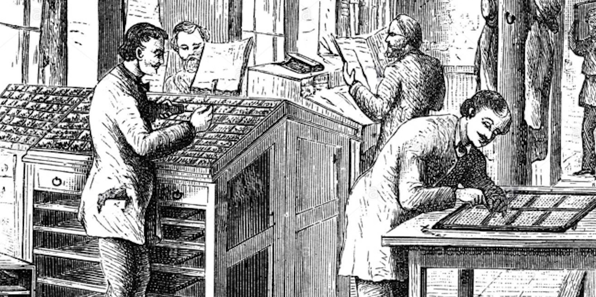
It’s important to note that in this context a font was a complete set of characters at a specific size and style. If you wanted a larger or smaller size of the same typeface, that was a different font and was a different purchase. Likewise, the italic or bold style of a typeface required a separate font. Being a collection of physical metal objects, fonts had to be sorted and stored. When a typesetter was to set a block of text, they organized the font in a large open boxes called type cases, with individual characters in their own separate cubbyholes. The majuscule characters were placed in an upper case, and the minuscule characters were in the lower case, which is where the terms uppercase and lowercase originated. (Other phases that come from moveable type include “mind your p’s and q’s,” referring to how easily the characters could be confused, especially since the metal type was in reverse; and “out of sorts,” which originally meant “lacking enough of a character to finish setting a page,” like when a typesetter ran out of E’s or ampersands. There are more!)
Flash forward to 1986 and the original Macintosh operating system. Macintoshes were the first inexpensive consumer computers that had proportional type (that is, letters that varied in width, unlike typewriters whose letters were all spaced the same). They also shipped with a variety of different typefaces built into the system; these could communicate with photostatic laser printers, which were also newly available to consumers and institutions at (relatively) low costs. The practical upshot of this was that text could be typeset and printed at the desktop level. While the printed text could be at any arbitrary size, the on-screen text had to be designed for the screen’s resolution. This required different description files for italics and boldface, as well as for each size: 9 point, 10 point, 12 point, etc. This division by typeface, style, and size was closely analogous to traditional cast metal fonts and so that’s what Apple called the files that stored this information.

As screens increased in resolution and CPUs increased in speed, eventually computers could resize text without needing separately sized files. But for a generation with no knowledge of fonts as anything but files on a computer, the name stuck, and neither Apple nor Microsoft, nor any third-party typeface designers, changed or clarified the file type. And so now “font” is synonymous with “typeface,” and in fact, few people who aren’t graphic designers even know what at typeface is.
And so it goes. Language always evolves, and people complain that words changing are being misused. The title of this essay is another example of this: many claim the phrase should be “fount of knowledge,” not “font,” because in this case we are talking about a fountain. It’s kind of silly. But as Ms. Mitchell sings, something’s lost and something’s gained. Sometimes we loose a bit of history, a bit of perspective, a distinction that goes beyond mere definition.
But, as I said at the start, I try not to be a smart ass. Some times I try harder than others.