The new Coen Brothers film The Ballad of Buster Scruggs features an impressive cast, but for me the true star of this anthology is the prop book used to join these violent, nihilistic western stories together.
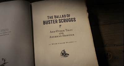
The book is presented as cloth-bound with an embossed cover. Cloth binding began in the 1820s and by the 1830s embossing was developed as well, leading to increasingly ornate treatments and eventually to foil-stamping. The understated, two-color printing marks this as a humbler work for a popular audience. I can’t place the typeface, but it looks quite a bit like Weiss (1928), which in turn was based on Italian Renaissance printer’s faces. The bold, simple design of the cover illustration brings to mind book designs from the 1910’s and 1920’s—a popular time for western literature, which had its major flowering of popularity with the publication of Owen Wister’s The Virginian (1902).
All of which makes it a bit surprising that the front matter dates the book to September, 1873. The decision seems to have been to locate the fictional book closer to the time the movie depicts, the 1840s (as referenced by the inclusion of stories of the Gold Rush and the Oregon Trail). But there are many details to the book which would make it an artifact of the turn of the century or even later. The barred “western” typeface used for the title here appears to be Barbaro Roman, a contemporary face mimicking Victorian sources. The type shows a slight embossing, which is the sign of letterpress, or movable type. But overall the title page “feels” contemporary rather than historic. The leading (space between lines of text) is much tighter than a 19th century source would be. The text is sized subtly as in the slightly smaller “THE BALLAD OF” and the slightly larger “BUSTER SCRUGGS”; an actual 19th century printer would not have such a collection of font sizes in metal, particularly for a display face.
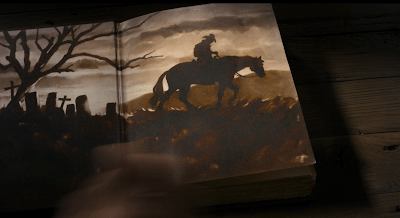
The color plates are the perhaps the most remarkable feature of the prop. Color lithography had been used to decorate letterpress books since the late 18th century, but it became more popular in the late 19th. These images had to be printed separately and were much more fragile than the letterpress pages, and so required protective sheets of onionskin or glassine to keep the ink from rubbing off. The illustrations in the prop book evoke the Brandywine School of illustration, named after the artists’ colony founded by Howard Pyle in 1895. It was to this school that illustrator N.C. Wyeth belonged, whose famous illustrations for Treasure Island (1911) and The Boy’s King Arthur (1922) set the tone for lush illustrations of adventure for decades to come. It’s these illustrations that would lead me to guess the book was a product of the 1910’s or the 1920’s if we were not given a “copyright.”
Even more anachronistic are the illustrated endpapers, rendered in a watercolor style that strikes me as more 1950’s or even 1960’s.
Lastly, I have nothing historical to say about the book’s dedication, except that I’m sure there’s a story here somewhere.
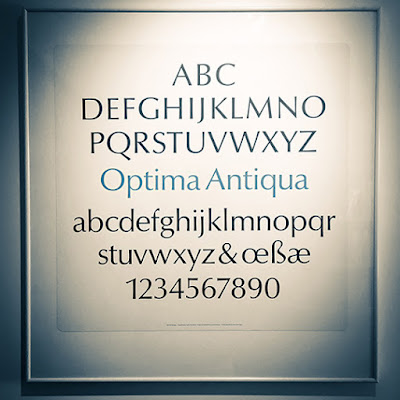
On my office wall I have a framed type specimen that comes from a silkscreened portfolio of typefaces offered by the Stemple Foundry which I found discarded in a dumpster behind my apartment back in 1993. The previous owner had also thrown out a copy of the classic of pre-digital typography, Designing With Type; I can only assume that whomever had thrown them out did so in a fit of pique regarding the then-nascent desktop publishing revolution. Whatever the reason, these beautiful, oversized sheets have become a treasured possession of mine, and especially the one framed on my wall, of Hermann Zapf’s 1955 Optima, my favorite typeface.
My framed specimen. In German, “Antiqua” is used as “Roman” is used in English when referring to a typeface.
Zapf turned to type design after working through World War II as a calligrapher, and his work is marked by delicate modulations in line width, such as come from pen lettering. His earlier masterwork, Palatino (1948), is technically an Old-Style typeface, but upon examination stems and bars show subtle tapers and flares, imitating the twist of a nib.
Palatino (1948)
Zaph’s calligraphic approach is all the more remarkable when viewed in the context of the dominant postwar International Typographic Style, whose famous neo-grotesque faces such as Univers or Helvetica were based on highly geometric, uniformly-weighted forms that eschewed decoration or beauty for beauty’s sake. In the midst of an increasingly homogenious, neutral, mathematical design, Zaph struck upon the idea of a sans-serif typeface that had the proportions and weight of a humanist hand, inspired by ancient Roman lettering he saw at the cemetery of the Basilica di Santa Croce in Florence.
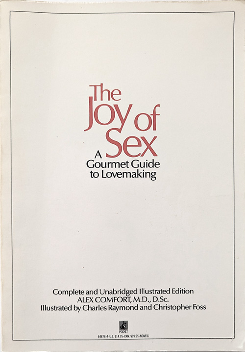
Released in the mid-1950s, Optima had its greatest popularity in the 1970s, when it became a favorite for package design, particularly cosmetics; and also for building signage. For those of us of a certain age, who snuck a peek into our parents’ bedroom, it’s probably best known as “the Joy of Sex font.” The slender, gently tapering strokes do have a sensual, vital feeling, particularly when close and overlapping, as in the book’s original title setting.
The Joy of Sex, 1972
For me personally, Optima was the typeface of information and science. It popped up in medical, psychological, how-to, and self-help books. Most importantly, Optima was used in the 1972 textbook, Biology Today. This crazy book was ostensibly a first-year college biology textbook, but its psychedelic (and sexually graphic) illustrations combined with a strongly humanist worldview to create an incredible moment of crossover between the counterculture and natural science.
Diagram from the 1972 edition of Biology Today, employing Optima. Please visit this link for highlights from this strange and wonderful book.
Since the 80s Optima’s popularity has waned, although its glyphic origins in Roman lettering have given it a place as the go-to letterform for incised or etched text when you’re trying not to use Trajan. The Vietnam Veterans Memorial’s names are etched in the typeface, as are the names of the lost at the National 9/11 Memorial pools. But present-day tastemakers such as Erik Spiekermann dismiss Optima as “tired & inappropriate.” In the age of the web, the cool mathematical typography of the International Style is championed, particularly Helvetica and Univers. I suspect it has much to do with the limitations of fonts produced by pixels.
As for me, my love of Optima is undimmed by vagaries of taste. In 2011 I was the graphic designer for the exhibition Dura-Europos: Crossroads of Antiquity, which featured archeological finds from the Roman city destroyed in 254 whose remains are in present-day Syria, and I was delighted to set the catalog and exhibition graphics in this timeless face, bringing Zapf’s inspiration full-circle.
Previously: Long, long ago, in the pre-Web age of Usenet (i.e. the early 90s), I began a series of silly newsposts about Rankin-Bass Christmas specials, with the intention of making my way through all of them. I swear that at the time, this was a completely original idea. I only made it through Rudolph the Red-Nosed Reindeer (1964) and The Little Drummer Boy (1968) before I set the project aside—although I did rework the two essays for the previous version of this blog back in 2012. These days, of course, there are a metric tonne of essays and videos on the subject, so what better time to resuscitate this?
Plot: After a four-second animated glimpse of the titular cricket eyeing the titular hearth, a dazed live-action Danny Thomas observes that “Christmas is…sorta special for all of us.” He explains that he’s never actually heard of this lesser Dickens story, and then chides the viewer for their ignorance of the same. Then he launches into the special’s theme song, one of nine (!) musical numbers, if you don’t count reprises (of which there are three).
We return to the animated world, which Thomas calls “Merrie Olde England,” although it should be noted that Victorian London was for most of its destitute population a squalid cesspools, full of criminals who literally called themselves Ripper. Anyway, we join the now-elderly Cricket Crocket, voiced by Roddy McDowall, volunteers the story of his life. Cricket has a ridiculous cockney accent, and say what you will about Dick Van Dyke in Mary Poppins, he’s an American; what’s Roddy’s excuse? Looking for some no-rent housing, he introduces himself to toy seller Caleb Plummer (played without accent by Mr. Thomas), and as crickets are a source of luck, is invited to stay at the shop/home. Personally, my experience with crickets in th house leans less towards good fortune and more towards sleepless nights of chirping, but to each their own.
Toby has a daughter, Bertha, voiced by Thomas’s real-life daughter, Marlo Thomas, i.e. That Girl. Her fiancé Edward (Ed Ames) has a Royal Navy commission that will take him to sea for several years, and he admonishes Bertha to not get up to any funny stuff in his absence with the song “Don’t Give Your Love Away.” After a couple of years tragedy strikes in the form a green, ghoulish messenger (Paul Frees) who looks a bit like the Hatbox Ghost arrives at the Plummers’ with the news that Edward has been lost at sea. The shock of this news induces blindness in Bertha, because that’s how eyes work, right?
A lot of stuff happens, but very slowly, and with a pair of easily forgettable songs (“Smiles go with Tears,” “Through My Eyes”. Caleb goes into debt trying to cure Bertha’s blindness, sells the shop, ends up working for a toymaker named Tackleton, who, being voiced by the inimitable Hans Conried, is easily the best thing in this mess. Tackleton is a villain because he is old and has a nose wart and because he won’t pay for enough paint to make his dolls smile properly. Oh, also he wants to abuse his employer-employee relationship to pressure Bertha into marrying him. Worst of all he has a foul-tempered crow named Uriah (also Frees) who wants to eat the cricket. But to be fair, Crocket has done absolutely nothing up until this point in the story, and has failed in his luck-giving duties entirely.
Two days before Christmas, Caleb is wandering about London carrying a comically tall pile of presents, toodle-pip and all, when he plows into an unhoused old man and invites him home as way of apology. This old man suspiciously knows Bertha’s name (dun-DUN). Caleb gets another song in here, about how there’s not going to be any presents or tree this year, but that’s okay, because Jesus (“The First Christmas”).
Crocket is determined to thwart Tackleton’s attempts at courting Bertha, so he and other assorted household vermin shake pepper into the toymaker’s tea from their perch in the rafters. In case the viewer is confused as to what’s happening, Crocket speaks the one-word sentence “Pepper.” Not one to take a fit of sneezing lying down, Tackleton instructs Uriah to remove the cricket “once and for all” and to enlist “professional help,” which implies that there is a market of cricket hit-men. As in, hit-men for crickets, not hit-men who are crickets. But maybe those as well.
Uriah visits a seedy dive bar for anthropomorphic animals where a cut-rate Peggy Lee cat sings about “Fish and Chips.” Eventually he does succeed in hiring a an unsavory monkey (Frees again) and bulldog. The trio seizes and bind Crocket in tiny rope, but instead of simply murdering the cricket like they should they attempt to sell him to a sea-captain (Frees once more) for export to China. And then the sea-captain draws a revolver and kills the trio dead. No, really. He straight-up shoots them. Happy Christmas, kids!
Look, this recap is going long, so I’ll spare you the sea journey and escape, and jump ahead to Crocket making his way back to the Plummers, where he discovers that the old man Caleb took in is actually…Edward in disguise! Oh, wait, you guessed that already. Having survived the shipwreck in which he was thought to have perished, Edward has been hanging around town mooning at Bertha. Edward explains that he wears the disguise because he feels guilty for Bertha being blind and all, but it seems far more likely that this is all some weird avoidant fetish. Crocket convinces Edward to just tell Bertha he’s alive already, and so he does, and they go ahead and get married using the wedding dress that Bertha was going to use to marry the old toy maker, and that’s just tacky. Tackleton is understandably upset, but Bertha calls him handsome, so apparently she has her sight back, or is just lying, but now everyone is super happy and it’s Christmas so nothing will ever go wrong again.
Notes: Hoo boy, this is a weird one. Remember how I said that Little Drummer Boy was the second Rankin-Bass Christmas Special? Well, I lied. Or rather, I completely overlooked this 1967 adaptation of Charles Dickens’s “other” Christmas book, The Cricket on the Hearth: A Fairy Tale of Home. Actually, Dickens wrote five Christmas books, but no one remembers the other three. And to be honest, few viewers remember this overlong, tedious, weirdly dark adaptation. I certainly don’t remember it being in the rotation of reruns every December in the 1970s when I was a kid. In fact, I only became aware of it when there was a wave of commercialize Gen-X nostalgia in the 2000s and all the Rankin-Bass specials made their way to home video.
This was Rankin-Bass’s first 2D animated Christmas special and the start of a long collaboration with Paul Coker, Jr., who was the production designer for this and all following Christmas cel animations, and for most of the following stop motion projects as well. Coker’s janky, expressive drawings were a mainstay of the Mad Magazines of my youth, where he was a contributor starting in 1961. However, the animation in this special—by the Television Corporation of Japan—sand-blasts out all of Coker’s stylistic quirks, with the end result being strange, dull, and bulbous character designs.
Paul Coker, Jr. drawing for Mad
Paul Coker, Jr. design? Sort of?
As for the content of the special: this adaptation removes the main characters and action of Dickens’ novella to focus on a peripheral love story, plus it adds a lot of goofy talking animals. In Dickens’ original, Bertha and her father start in poverty, and she herself is blind to begin with. Today Dickens is often seen as a sentimentalist who relies heavily upon unlikely plot twists, but in his day he was a social reformer. He wrote of the plight of the destitute and the unfairness of their working conditions. For Victorians, blindness was thought to be congenital, and the disabled were not supposed to wed, so having Bertha find love was a political statement. All of which is to say, this special captures none of the spirit, or tone, or, you know, actual plot of the story.
The live-action framing featuring Danny Thomas is an oddity for Rankin-Bass, and makes a big deal out of the celebrity voices—a long and unnecessary coda has Thomas list all the actors over stills of their headshots. All of the Christmas specials featured players who were famous in their day but mostly forgotten now; in this way they were, in a manner, the progenitor to the modern DreamWorks approach to stunt-casting. Thomas and Ames sleepwalk through their dialog. Marlo Thomas is slightly better, bringing her charming squeak to a nothing of a character. And anything with Paul Frees and Hans Conried in it can’t be all bad.