When, as a kid, I learned the word raconteur, I thought that the role wasn’t simply a matter of one being good with stories; I thought it was a career one could have, and even be paid for. I’m not sure why I came to this conclusion, or who I thought would be writing the checks, but it seemed to me like would be a good job to have.
It may have been this early misconception of what the life of the raconteur entails that has inspired me to tell and re-tell so many dumb, over-sharing stories about myself. I think I have gotten quite good at it. This is a collection of my go-to yarns I employ at parties and other events. If you’ve met me in person, you may have heard some of these anecdotes before.
These anecdotes are guaranteed1 to be 95% True. The other 5% is poetic license2.
One of my earliest memories is the time I nearly cut my own finger off. I was around the age of four or five and I was attending another kid’s birthday party. The event was happening in a large apartment in Manhattan and it was early 70’s mod in design, full of funky furniture and ficus plants. There were several dozen kids on hand, and looking back on it, this family must’ve been fairly well-to-do; they had two televisions—unheard of at the time.
We kids were pretty rambunctious, running through all the rooms and jumping on beds. In the master bedroom there was an exercise bicycle. To understand what happened you need to know that in the 70’s exercise bikes looked like half of a regular bike, jacked off the ground; they had a normal bike wheel in front, with a rubber tire and spokes. So some of the kids were hopping up on the device (which was a novelty at the time) and pedaling as furiously as their five-year-old legs could go. I was waiting my turn, but their were a lot of kids in front of me, so I stuck out my right hand and let the whirring spokes brush against my fingers, and—
When I pulled my hand back it was gushing blood. There was a tear that extended across the width of my index finger, which felt a bit wobbly like it might come off entirely. All around me kids were shrieking and running in circles. Eventually the grownups in the other room discovered what had happened and my mom wrapped my hand and swept me up in her arms. As I was taken away to the hospital, all I could think was, I’ve ruined the party. I’ll never be invited again.
When I think about it, I’m amazed that I still even have hands. The bike incident was just the start of a long line of dumb injuries. I have slammed my fingers in doors; I have been bit by dogs; I got a staph infection in my wrist when I I’ll-advisedly caught a frog in a stagnant puddle. Aside from the massive scar under my index finger, I have one about as large on the ball of my right thumb. Here’s its story:
The house we were living in when I was seven was a strange building whose basement had storage spaces that were cut out of the ground and left unfinished; a landscape mural that was screen-printed on the living room wall and had a scalloped wood trim glued around it by way of a frame; and a couple of built-on additions. One of these was a weird narrow hallway with stairs leading to the back yard, and it was pretty unusable as a living space. My parents stuck old newspapers in a pile back there to await recycling, and I remember that when I was bored I would sift through these to find old comics pages, and particularly look for old Jumble puzzles. These were the old skool ones drawn by Henri Arnold and Bob Lee, and they were drawn weird in a way that fascinated me. Also by the Jumble was the bridge column, and that made no sense at all, but the printed ♠♥♣♦’s were pretty neat.
One day I was looking at a Jumble and trying to figure out what GNATFREM might be rearranged to. As was my habit while in thought, I was hopping up and down (a stim I’ve grown out of) and paying no attention to my surroundings. I landed wrong, on the edge of the top stair, and I fell down backwards, trying to remain upright. Reaching the bottom, I held out my right hand to stop the fall, and it went straight through a diamond-shaped pane of glass in the door. And as my long-suffering mom gathered me up for another trip to the hospital, all I could think was, oh no, not this again.
The dot.com I worked in as a web designer back from 1999 to 2002 was never going to succeed, but not for lack of confidence. It was full of a bunch of cocky twenty-somethings burning through VC like it was an ATM and was led by a fast-talking hirsute ex-hippie who could convince you that we were all headed straight to the moon and would be retiring on our stock options any day now. It was a silly time, not just for my company, but for the entire new economy™ generation. How silly? There was a service at the time, kosmo.com, that would purchase and deliver anything you asked for without a fee. In my office there was a competition to see how badly we could abuse this by ordering, say, a single pen or a container of Tic Tacs.
At the office I would get a whole different mess of junk mail than what I got at home. For the most part this consisted of endless AOL free trial CDs, which I eventually made into an elaborate mobile with the use of dowels, string, and duct tape. (I hung this over our conference room table because it was the new economy! Japes and waggery were right there in the job description.) But my single favorite solicitation was an invitation to join yet another subscription-based classics book club. Printed across the back flap of the offer’s envelope was the motto “Because your taste in literature soars above the quotidian.” This struck me as so comically pompous that I immediately cut the flap off and pinned it to my workspace’s cork board. My coworkers also found the phrase ridiculous, and eventually “soars above the quotidian” became a catchphrase amongst us all, as in “this pizza really soars above the quotidian.”
When I was young my parents never had alcohol of any sort around the house3. Drinking felt like something forbidden and I was actively embarrassed by beer commercials on television. But my paternal grandparents always had two liqueurs squirreled away on their crowded basement shelves: crème de menthe and crème de cocoa; as their drinking years began in 1933 with the end of prohibition, their drink of choice was grasshoppers. But I had no context for this when I discovered the cache, which both scandalized and intrigued me. This was my first exposure to spirits, and I thought this candy-flavored cocktail must be the height of sophistication, still imbibed by alcoholics everywhere. Years later, when I was a young adult I tried ordering a grasshopper at a tavern; all I got was an exasperated look from the bartender.
During my undergraduate years I did work-study at the college’s science library, which was far less busy than the main library, so I got to spend time checking out the various academic science journals and their esoteric titles, of which my favorite was The Journal of Sedimentary Petrology. When eventually I took an introductory Geology class I understood the periodical’s name, and that took away some of the fun. However, my familiarity with Geologic terms did eventually come in handy.
One slow afternoon I sat at the circulation desk reading comics (this was ’87? I was probably reading Love and Rockets, let’s say I was, that makes me seem hip). All was silent, even for a library, and that’s why I had a jump-scare when I glanced up from my book and saw a smiling, balding man standing before me. He could have been there several minutes. He said nothing, but nodded and widened his grin.
“Can I help you?” I asked. “Yes, mm-hmm,” he said, and nodded and grinned more.
Since it was apparent he was not going to offer more, I inquired, “Are you… are you looking for a book?”
“Yes, a book, that’s right. I’m looking for a book on eras.”
I blinked. “Eras? um… do you mean like geologic eras?”
“Yes, geologic eras, a book on that.”
“Any, uh, era in particular?” I had just covered these in class. “Paleozoic, Mesozoic, Cenozoic?”
“Oh, Mesozoic, yes. A Mesozoic book.”
I paused, confounded. “Are you… are you looking for a book about dinosaurs?”
He nodded and smiled. “Yes, that’s it, dinosaurs. I would like a book about dinosaurs.”
When my oldest child was a toddler, my wife and I were still enrolled in graduate programs at Boston University, and our schedules necessitated child care hand-offs, often on campus. I spent many afternoons carrying our kid through the halls of the twin buildings that make up the College of Arts and Sciences. One afternoon I was walking down a hallway with my child on my shoulders. They had only recently started to talk in semi-complete sentences. So I was surprise to hear them say, “Daddy, this floor looks waxed.”
I looked at the floor, which was some sort of worn but glossy mid-century rolled linoleum. I couldn’t understand why my kid would care about the floor or how they would know what waxing was. I said, “Well, it does look pretty shiny, I guess.”
“Yes,” they said. “Shiny.” Then, after a pause, they asked, “Daddy, what am I talking about?”
I regularly donate platelets at my local Red Cross blood center, which requires being hooked up by needles and tubes to an apheresis machine for about two and a half hours, at which point you are rewarded with a seat at a table full of terrible snacks. I like giving platelets because it forces me to be still. It’s moving to think that out there in the world are people whose lives were saved by being given a literal part of you. Also I get to watch dumb shows on Netflix. Last time it was a couple of episodes of Wednesday.
Once when I was done with a donation two of the phlebotomists were clucking over me as they removed the medical tape that held the plastic tubing in place. This tape is tenacious and requires a sharp pull to detach, and they were both amused and alarmed by how much of my arm hair was being lost. This was the conversation they had:
Phleb. # 1: Oh lord, this takes so much of you with it! It’s like a waxing!
Phleb. # 2: (holding up tape covered in hair) Yes, just like a waxing ain’t it!
Phleb. # 1: (laughing) Yeah that’s just like when I get my— (long pause) …my eyebrows done.
When my son was about five he became curious about the relative power of animals, machines, and anything else. He expressed this interest by asking his parents who would win in a fight by saying, for instance, “shark against bear who wins?” His queries were always in the form of X against Y who wins? “car against truck who wins?” “dragon against giant who wins?”
Eventually his questions became very weird, like “house against lightning who wins?” or “cake against fork who wins?” and even “plane against television who wins?”
To this day I still think about pairs of things in this manner.
In 1985, my senior year in high school, I was an AFS exchange student to Israel. Most of the other kids in the program were Jewish and were using the exchange as sort of a Birthright Tour (this was before Birthright Israel was an organization), but I was a goy and I had never studied Hebrew before and I found it very difficult.
One evening in my host family’s home I was trying to use what little Hebrew I knew, and so I asked for a glass, which is pronounced in Hebrew as “cōhs,” but instead I said “coos.” My host sister’s face drained of color. My host brother said, “you mustn’t say that, it’s a very dirty word, you must say cōhs.” “Oh,” I said, and then I asked, “but you say couscous, don’t you?” And he said, “Yes, of course, but—” and then he snorted and said, “oh yes, very funny!” And from then on whenever my host mother, who was from Morocco, served couscous, my brother and sister would laugh uncontrollably.
When I first met my wife Marina, I apparently blew her off at an orientation party thrown by the college’s theater group. As she tells it, she approached me while I was standing at the snack table and said, “oh, we’ve met before, you’re on the same dorm floor as me”; to which I said, “uh-huh,” loaded up on cheese and crackers, and wandered off. I, of course, have no memory of this, although I did remember passing her on the dorm floor we shared and thinking that there was no earth on which I would have a chance with a woman like her.
Eventually we did start to date. One afternoon early on I suggested we take a walk around Earlham’s campus. I mentioned that I knew where there was a grave on the wrong side of the fence. By this I mean Earlham College borders a cemetery on its western side, and there is indeed a grave which, strangely enough, is on the wrong side of the fence, on college property.
She agreed to go on the walk. When we came across the headstone, Marina was very surprised and said “oh, I thought this was like the glass tomb.” I asked her what she meant and she said that during new student week she was told that a common pickup move was for older students to tell new students there was a glass tomb somewhere in the cemetery and then take them out looking in the middle of the night, to eventually put the moves on them. I was taken aback by this and asked if she really thought I was just using a line on her, to which she replied, “Yes, but I went along anyway.”
In our early 20s, my wife and I were living month to month in grad-school poverty. We rented a car to drive back to the midwest for the holidays, and lacking the money for a hotel, we asked to stay at the home of a distant relative on the way. This person’s relationship to us was never (and still isn’t) quite clear to me; I believe he was my step-father-in-law’s cousin. Maybe second cousin. I think he was some sort of medical doctor?
In any case, he and his wife (they didn’t have kids) were in their mid-30s. Their house was a huge McMansion and we were fed more food in one evening than we could get in a week. Our host was also extremely enthusiastic about red zinfandel wine and he poured us both many large glasses and insisted we drink more. Then he said there was one thing we must do to repay his hospitality, and for one horrifying moment I thought that he was going to request that we swing with him and his wife. But instead, he showed us to a sort of rec room which had an enormous television (by 90s standards) and there he had us watch along three VHS recordings of Gallagher concerts. And honestly? That was worse.
One winter I slipped on the cement and brick stairs outside our house. This could have been a serious accident if I had hit my head; as it was, I was bruised all up and down my torso and it was painful to draw a deep breath. So I went to a doctor to see if I might have cracked a rib.
Dr.: It could be a cracked rib or maybe not; we could get you an x-ray, it’s up to you.
Me: Up to me? Aren’t you the doctor? Isn’t this something you need for your diagnosis?
Dr.: Not really. We don’t actually do anything for a cracked rib.
Me: Then why get an x-ray?
Dr.: Then you’d know if you had a cracked rib.
At the turn of the millennium my wife and I had just had our second kid and we were all living stuffed together in a small condominium, two kids, two grownups, and one fat black cat. His name was Prospero and he was constantly sneezing up massive boogers. He always wanted to run away from home, and if the door were open even a few seconds he would dart out. Looking back on him now, I realize he was a bit of a jerk, but we couldn’t have a dog in any of the four rentals we’d had during the 90s, and so we were happy with what we could get.
The condo didn’t have much going for it, but it did have a shared pool, and my older kid wanted to have their birthday party as a swim party, so the day of the party Marina drove around getting food and decorations and such. As we returned back from our last errand, with about a half-hour to go to the party, Marina pointed and said, “It’s Prospero! He must have escaped while we were running in and out!” I looked and saw the fat black cat crouched under a bush. It was so close to the party and we still had to set up so Marina asked me to catch Prospero while she got everything ready. She went into our condominium’s building and I crouched down. It was evident that the cat was not going to cooperate; as I reached out, he swatted my hand, first with the pads of his paw, then with extended claws.
I was already tired from our activities and feeling grumpy so I snatched up the protesting feline, holding him at arms length as he squirmed. I was heading for the door when Marina came down the stairs and yelled, “John, that’s not Prospero! Prospero’s inside!”
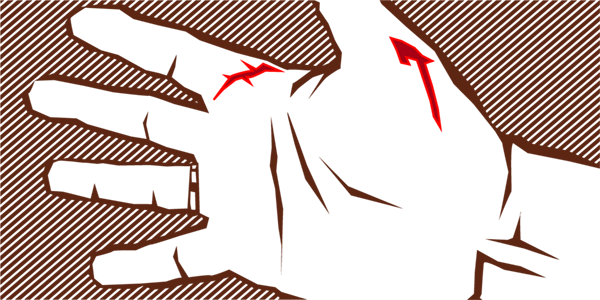
I looked at the hissing creature to see if I were holding some other fat, pure black cat. And then it sunk its fangs deep into the web between thumb and index. It curled its body up and began raking its back claws against my hand, shredding large gashes into my palm and fingers. I was dumbfounded and it didn’t quite register that I was holding the wrong cat. “Let it go! Let it go!” Marina shouted. So I released the cat, who hung on a few seconds longer by its teeth, and then tore off across the parking lot and into a neighboring yard.
My hands were an absolute mess and I was bleeding everywhere. Marina got me some gauze. We decided that it was too late to call off the party, so she would drive me to our HMO clinic, drop me off, and hurry back to greet our guests. As I wrapped my dressing, I could see my kid looking at me with sad eyes. And all I could think was, I’ve done it again, I’ve ruined another party.
- This statement does not constitute an actual guarantee. ↩︎
- This does not imply an actual license. ↩︎
- Or at least they hid it well? ↩︎
header image: Lucia Mathilde von Gelder (1865-1899), Der Märchenerzähler