A Facsimile Edition; with commentary by the author

I published the first edition of this commentary in 1997, having just learned how to code HTML from a disreputable Usenet post. The website that this work first appeared on, ungh.com, has long ago evaporated with the rest of the Web 1.0.
Recently, however, I recalled the essay in a dream1, and fortunately I was able to find a .doc copy languishing in the recesses of a forgotten directory on a floppy disk that had fallen behind a shelf in my basement2.
It’s been nearly 20 years and the wisdom of old age3 compels me to revisit and enlarge this seminal work. So I present here the second edition, with newly scanned facsimiles, enlarged commentary, and new annotation.
A note on the text:
Fortunately for scholars, the original MSS for the works discussed here arrive to us in almost pristine condition, thanks to their having been cached in the remarkable School Days edition #566, produced in 1966 by the WinCraft corporation of Winona, Minnesota4. In addition to my earliest writings, this folio contains many other historical items, including report cards, numerous second and third place ribbons, and a certificate awarded for “knowing and making the letters correctly in the daily use of legible manuscript handwriting.”

I Sit in It
Written in Mrs. Kubasko’s p.m. kindergarten class, Harding Elementary School, 1974.

I Sit on It, #2 pencil on ruled Manila paper, 10.5″ x 8″
Text:
Jo Johl John.IS I Sit in it
Meet me
See Mat on it
Notes:
From 1974 until 1977 I attended Harding Elementary School in Youngstown, Ohio. Although today it seems strange to me that there should have been a public school named after the second-most hated President of the United States5, at the time I was just happy to be sharing my blocks with Nora, the little red-haired girl who was my first real crush. We would almost exclusively use these blocks to design elaborate traps, which is an interest that I now recognize as one of the stranger symptoms of autism6.
I Sit in It is the earliest extant MS in my handwriting, and it demonstrates many of the themes that would mark my later work. Written in first person, the story is plotless, simple, and relies upon suggestion for its effects. The most obvious questions for the reader are: “What is ‘it’? Why does the narrator sit ‘in’ it, while Mat is ‘on’ it? Where are we to meet?” Although these questions are ultimately unanswerable, they are essential to the story’s meaning. By the promise of rational answers and the lack thereof, the reader is led, koan-like, to a new level of understanding. It is only when the familiar categories of “in” and “on” are deconstructed that enlightenment begins.
The true subject of I Sit in It, then, is the mutability of identity. Note the strikethroughs at the top of the page: Jo becomes Johl becomes John. And then, a final period after John announces the completion of the metamorphosis. But should we assume that this teleology is valid? It seems unlikely.
The Missing Bird
Written in Mrs. Wren’s first grade class, Harding Elementary School, 1975.
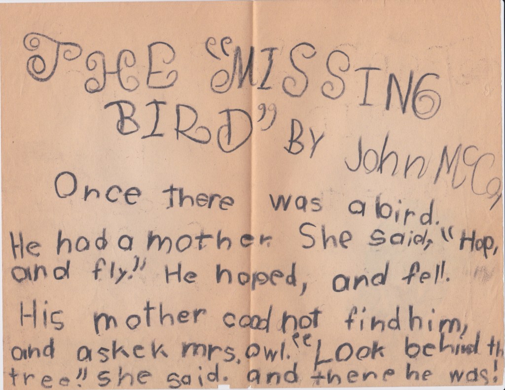
The Missing Bird (recto), Crayon on Manila paper, 10.5″ x 8″
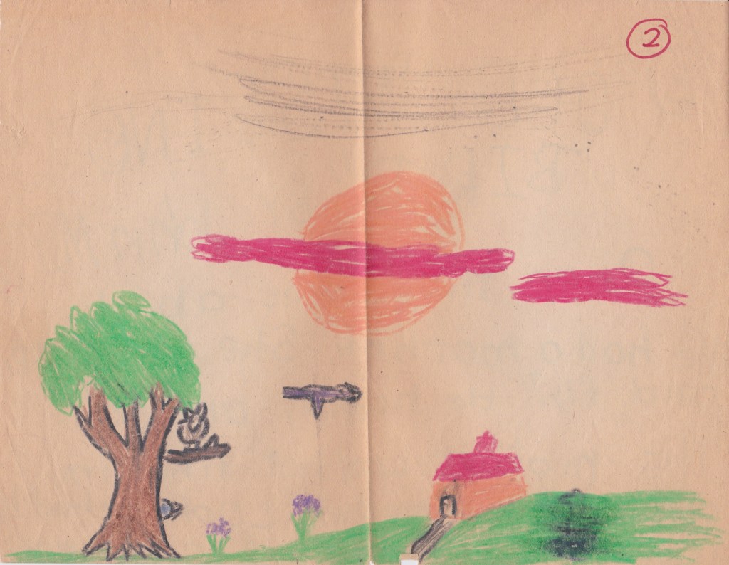
The Missing Bird (verso), Crayon on Manila paper, 10.5″ x 8″
Text:
THE “MISSING
BIRD” BY John McCoy
Once there was a bird.
He had a mother. She said, “Hop,
and fly.” He hoped, and fell.
His mother cood not find him,
and askek mrs. owl. “Look behind th7
tree.” she said. and there he was!
Notes:
Mrs. Mathilda Wren, my first grade teacher, claimed to have served in the armed forces during wartime8. She also had a pair of decorative plastic mushrooms on her desk which she claimed were poisonous. The poison was so strong, she said, that a child need only touch the fungi to die a painful death. Today I believe her intentions were to keep her students’ hands off of her belongings, but the result was a horrified classroom of six-year-olds. Why would anyone keep something so dangerous on their desk? we wondered. What if we brushed against the mushrooms by accident in the midst of show and tell? Eventually, the brighter students in the class realized that the mushrooms posed no real danger, and they terrorized the rest of us by threatening to force us to touch the forbidden objects.
Some of the anxiety of this situation is no doubt reflected in The Missing Bird, a story which at first appears to be straightforward, but which reveals a sinister underbelly upon closer examination. Although baby animals are often separated from their mothers in children’s literature (see P. D. Eastman’s Are You My Mother? [1960] or Eric Hill’s Where’s Spot? [1980]), it is not so typical for the mother herself to be the author of the separation.
The reader must decide for themself whether the mother truly believes that her child can fly or if she is malicious in her instructions. The central tragedy of the fledgeling bounding forth only to plummet, Icarus-like, is vivid no matter what the mother’s motivation. The chance misspelling of “hoped” instead of “hopped” is felicitous: just as the bird, we too hope for the best as we venture into the world, only to be brought low by gravity.
Owls are traditionally figures of wisdom, but the sensitive reader will question the narrative value of the tacked-on character of Mrs. Owl. Why can’t the mother see for herself where her child is? She knows he must have fallen near the tree. Perhaps the mother isn’t really looking.
The Restaurant
Written in 1976 or 1977, location unknown.

The Restaurant (recto), #2 pencil on white Kraft paper, 8″ x 10.5″

The Restaurant (verso), #2 pencil on white Kraft paper, 8″ x 10.5″
Text:
There was a restaurant where a man
who sold pencils would stop every
day to eat breakfast. And all the
morning he would shout out loud to
him self as if he wanted everyone
to hear. There was also a threesome
that had a favorate table to eat
at. To day, however, as they where sitting
down, they noticed a lady 6′ tall,
long-black haired, coming in. They
shuffled around nevously, collecting
cups, plates, and silver ware, and sat down
making it appear as if they just had
breakfast. Then, the lady sat down
drank half a cup of coffee, and
then began talking to herself.
Not outloud, like the pencil-
man, but in a soft murmur.
The threesome left by the
backdoor. And even after the
tabe was wiped & cleaned, the
lady still looked on, still
clutching the half-emty
cup. The pencil-man glanced over,
saw the lady, and ran out the
door. The lady soon left.
The next day, the threesome had
just finished breakfast when the lady
came in. They left. The lady spotted
the pencil-man talkig outloud and
went to the chair next to him. “It’s
to cold outside! The birds are
freezing, dam9 it!” said the pencil-
man. “I know nobody wants to, but
somebody’s got to feed the birds!”
“May I have some tea, herald?” asked the
lady. The man grabbed the teapot,
poured the lady some. “I ain’t nobody
named herald,” the man said.
The next day the man & woman
came together. The threesome left
for good. The man & woman began
to talk together. They left and moved
into an apartment together wher
all the do is tall softly to one another.
And the restourant will never be the same.
Notes:
No writings save for notebook pages of cursive handwriting practice remain from Mrs. Vernarsky’s second grade class, which is a shame, because that means I won’t be able to point out that Mrs. Vernarsky had an enormous beehive hairdo (except in this sentence). When I try to remember what I wrote in her class, all I can remember is being caught drawing “Big Daddy Roth”-type hot rods, the kinds with monsters and big chrome exhaust pipes10.

Even if there is no surviving literary record of my second grade year, its importance to my personal development should not be underestimated. It was in the second grade that I was found to be nearsighted, and the resultant eyewear immured me from my playmates. Oh, they still traded their Now ‘n’ Laters with me, still dropped their Scooby-Doo valentines in my box, but dodgeball was forever changed.
It’s informative to look at a report card from this time. While I always got good marks for “Health Habits” I was slipping in “Rules and Regulations,” “Respects Rights,” and the notorious metric of “Plays Well With Others.” This, then, was the beginning of of my Bad Boy phase:

Small wonder, then, that alienation should be the major theme of The Restaurant. None of its characters are able to communicate with one another, preferring instead to shout or murmur nonsensically—or, in the case of “the Threesome,” to abstain from discourse entirely. Although I cannot recall my initial conception of The Restaurant, its obvious models are Sartre and Beckett, perhaps by way of a particularly bleak skit on Zoom.
For example, the ostensible protagonist, “the Pencil-Man,” craves attention from an indifferent world, but is paralyzed by his own incompetence. “Feed the pigeons,” he admonishes, but why doesn’t he just feed them himself? Surely there is complementary bread at the restaurant. At least the Pencil-Man is given a possible motivation by the narrator: he wants somebody, anyone to hear. When “the Lady” makes her appearance, she is described objectively, blankly, as though she were a suspect in a police line-up: “6′ tall, long-black hair.” But what is her crime? Merely her attempt to connect with another human. “Herald,” she calls the man, and in the misspelling we may see the Pencil-Man as John the Baptist, another abrasive hairy man who shouted a lot. The Pencil-Man, however, is unwilling to take the role of martyr; he instead offers tea, as though a participant in a Zen Buddhist chadō ceremony. Thus we see the contrast between Western and Eastern paths to transcendence.
Although they strike up a relationship, romance does not seem to be a remedy for the alienated Pencil-Man and Lady. Theirs is a sexless relationship, in which all they do is talk softly to one another. This would seem to indicate communication, but it is a communication devoid of either action or context. How will they survive? Who will sell the pencils?
Perhaps the most enigmatically fascinating characters of all are “the Threesome.” In contrast to the narrator’s clinical portrayal of the Lady, the Threesome are given no description, not even to differentiate them from one another. Are they men or women? Are they lovers? Why are they so threatened by the arrival of the Lady? Possibly they represent dissolution of identity, the generic, interchangeable personality of Late Stage Capitalism. If so, their aversion to the Lady makes grim sense. The Threesome attempt to absorb the Pencil-Man into their hive mind, only to have the Lady encourage his eccentricity. Theirs is the true tragedy of the story, as they are unable to even enjoy their breakfast, preferring the imitation of eating to true nourishment.
And the pigeons? What of them?
- Not really, but it sounds poetic. ↩︎
- This is a bald-faced lie. Why would I even write such a thing? ↩︎
- Not a lie per se, but stretching things. ↩︎
- Still in operation as of 2025, although these days as a purveyor of sports memorabilia. ↩︎
- As of 2021, Harding is only the third most hated. ↩︎
- This correlation is posited in some versions of the self-administered “Aspie Quiz,” see https://rdos.net/aspeval/#925 ↩︎
- Unclear whether the “e” was omitted intentionally or if it was drawn on the table alongside the MS. ↩︎
- Vietnam? Korea? WWII seems unlikely. Most likely of all was she was fucking with us dumb kids. ↩︎
- Such fire! ↩︎
- This was when CARToons Magazine was at the height of its popularity and there always seemed to be an issue being passed around by the boys in class. Looking back, I am confused by my interest here because I have always been indifferent to cars. But I do like “Big Daddy” Roth. ↩︎