Less Fun than a Barrel of Crackers

Header image: S.O. Grimes general store, Westminster, Md., c. 1900. Image via Library of Congress.

Another day, another shot fired in the culture wars: this time, the internet is losing its collective mind over the new logo for Cracker Barrel. If you are unaware of the controversy, congratulations—you might consider skipping reading the rest of this essay to remain in blissful ignorance.

To summarize: Cracker Barrel, that paragon of blandly inoffensive roadside dining, has decided that its long-standing theming to evoke early 20th century general stores might be limiting its appeal to Gen Z, and so has embarked on a brand makeover that downplays the hokey country charm. Part of this rebrand is a simplified logo that ditches an illustration depicting a gentleman in overalls perched on a wicker seat ladder back chair and leaning against the titular barrel. (This man, “Uncle Herschel,” was a real person.)

Cracker Barrel logos
Cracker Barrel logos, left: 1977, right: 2025.

To say that the change has not been taken well by the chain-restaurant-going public would be an understatement. Some of those seeing red also see a political conspiracy—from “influencers” who say that the logo is stripping culture and heritage away from rural white Americans, to Fox News hosts claiming that corporate moves such as this logo change are why President Trump needs to send troops to Chicago. Underlying these criticisms is the assumption that the rebrand is part of an insidious “woke” movement perpetrated by American businesses.

The truth is, no corporation wants to touch anything political with a twelve-foot pole, especially these days. Look at what happened to the department store Target, which caught flack from the right for daring to stock pride merchandise, only to get hit even harder from the left for caving to anti-DEI pressure. Walmart and Amazon have also been subject to boycotting headaches over DEI policies and allegations of abetting the Trump administration. No, politics have nothing to do with the decision to change the Cracker Barrel logo—although it remains to be seen if political outrage from consumers can be sustained.1

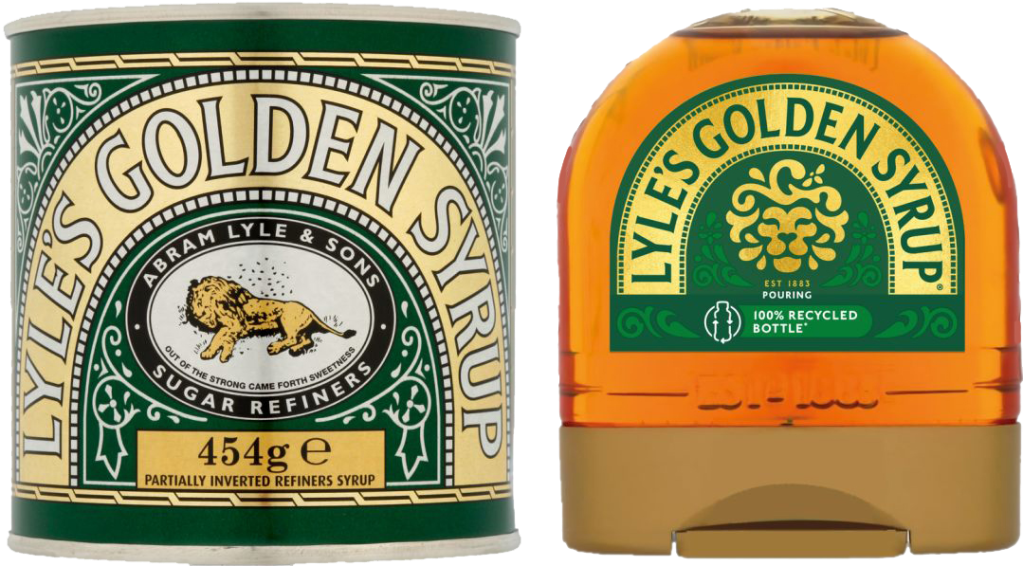
The rebrand reminds me of a similar kerfuffle last year involving the British confection Lyle’s Golden Syrup. Americans may be confused that such a product exists in the first place; but they would be even more baffled by the logo for the sugar refinery Abram Lyle & Sons, which consists of bees swarming about the corpse of a lion. The company’s motto, “Out of the strong came forth sweetness” points to the source of this imagery, the biblical tale of Samson’s riddle2. All of which is to say that this is the most badass logo ever, as well as being an amazingly long-lived one—it dates to 1883. In 2024, Lyle & Sons decided that this work of art was too morbid, and replaced it with a more anodyne illustration of a syrupy lion. This change was also greeted with political accusations.
Golden Syrup
Lyle’s Golden Syrup rebrand. Original design on left, 1883; new design on right, 2024.

But just because I doubt that these choices were motivated by politics doesn’t mean the detractors don’t have a point: something basic is being lost here. In both cases the companies have discarded character and context in an effort to streamline their identity. I have written previously about the often misguided penchant art directors have towards simplifying their brands. I suspect that the lion’s share (ha) of this tendency is simply following trends, and the current fashion in corporate design is simple, flat typography and short (often single-word) brand names. To the extent that someone actually gave this a thought, the rationale is to remove any attributes that might complicate a consumer’s attitude towards the brand. It also reflects the desire of new executives to mark their territory by peeing on it—see HBO’s constant rebranding, or Elon Musk destroying the only part of Twitter that had any value, its name recognition.

If you want to be charitable, and I try to be when I can, the move towards brand simplification also reflects a longstanding adage in design—be it visual art, design, writing, or engineering: “less is more.” This saying, often misattributed to Mies van der Rohe, emphasizes clarity and utility. The goal is to focus on what is essential. Practitioners of this belief make outsized claims about the effects of this approach. In his seminal work Understanding Comics (1993), cartoonist Scott McCloud claims that idiographic drawings amplify meaning. He also claims that in simplified, “cartoony” design, viewers can insert themselves into the depiction3. I love McCloud to pieces but this all seems a bit farfetched to me.

McCloud
Scott McCloud claims that simplification leads to self-identification. Understanding Comics, 1993.

There’s a lot to be said for purposeful simplicity. Growing up in the 70s and 80s I was surrounded by, and loved, logos by Saul Bass, Milton Glaser, and Paul Rand, all of whom were known for absolutely iconic, geometric, minimalist designs. But these artists, working before digital tools, had to visualize their designs as tight, abstract forms. They did not select something they liked from the font menu, slap it on a generic color shape, shut down Adobe Illustrator and call it a day. Even at their simplest, the great Modernist graphic designers had a sense of context and of play. They weren’t afraid of their work conveying an attitude.

logos
Logos by Saul Bass (left), Milton Glaser (center), and Paul Rand (right)

And it’s attitude that’s missing from the Cracker Barrel rebrand. The original logo wasn’t great, in much the same way that the actual restaurants aren’t great. But it did have a point of view, and that’s what the new design is lacking. As a rule of thumb, good design is supposed to not draw more attention than the message it conveys. But when design fades away into no design, the message also disappears. When you look at the new Cracker Barrel logo, ask yourself: would you even know what good or service it represents if you didn’t already know the brand name? Here, look at what happens when you replace the words:

Lorem Ipsum

Is it a clothing line? Is it a cake mix?


  1. It also remains to see if Cracker Barrel is going to remain committed to this rebrand, given the fact that their stock is being absolutely destroyed. ↩︎
  2. If you’re not familiar with the Book of Judges: Samson, on the way to visit his future bride Timnah, is set upon by a lion. The hero kills the beast with his bare hands. Sometime later he returned to the scene of the attack and found that a colony of bees had made a hive in the lion’s body. Samson eats some of the honey. Returning to marry Timnah, he tells the bridal party (made up of Philistines, who are his sworn enemies) that they must answer a riddle or forfeit their clothes: “Out of the eater, something to eat; out of the strong, something sweet.” Ultimately this story does not end well for Samson, Timnah, or the Philistines. ↩︎
  3. Amusingly, in his essay “Modern Cartoonist,” comics artist Dan Clowes takes exception to McCloud’s theory: “Comics tend to lean toward the iconic (‘The Adventures of a featureless blob'”‘) because it encourages reader identification. Let’s get away from this arena of vagueness (a cheap gimmick designed to flatter the shallow reader)” Eightball 18, 1997. ↩︎

Fonts of Knowledge

Nobody likes a smart ass, and I try my best not to be one. But there’s one pedantic quibble that I struggle with, and that’s pointing out when someone uses a word isn’t quite the word they want. I come by this honestly enough: I’m a writer who values clarity and I have that autistic compulsion to be precise, even when I know it’s a linguistic battle I won’t win.

For example, back in the 90’s, people started using the word “impact” as a verb: This decision impacts us all. This drove me absolutely nuts, because “impact” was and had always been a noun, and it meant “a point of collision,” and when people used it as a verb what they really meant was “affect:” This decision affects us all, and using “impact” was dumb business-speak, using a word that sounds important instead of the perfectly good word that is the right one. I remember talking about this with a professor of mine and she pointed out that exactly the same sort of complaint was lodged against the word “contact” which was not used as a verb to mean get in touch with, reach out to, write, phone, etc. until the 1920s. She told me this as a friendly way to say “just let it go,” but the effect on me was I immediately stopped using “contact” as anything but a noun.

This is a lot of preamble to arrive at the subject of this essay, the word “font,” which these days generally means “typeface,” or “the digital file that describes a typeface.” But this isn’t its exact use, at least, it wasn’t until very recently, and I feel like something has been lost in the contemporary definition—precision, yes, but more importantly the richness of printing history, and understanding the transition from an analog to a digital world.

When in the 15th century moveable type printing came to the Western world from its origin in China, the models printers used to design letters came from existing medieval and Renaissance hands. Gutenberg’s Bible (c. 1455) used a movable type equivalent of the 12th century hand blackletter, an ornate style executed with a chisel nib, which these days is mostly used on diplomas and other formal or legal documents (or, sadly, by white supremacists). As the technology of moveable type spread, Venetian printers modeled their letters after the humanist minuscule hand, a Renaissance cross between classical Roman carved text—which only had capital letters—and the manuscript style used in copies of the vulgate bible—letterforms we would now identify as lowercase. Nicholas Jenson (c. 1420–1480) is today credited with developing the modern printed Roman alphabet.

To produce enough type to set pages, designers would cut master forms called “punches” from slugs of steel; the craftspeople who did this were called “punch cutters.” These punches would be hammered into copper molds which would then be cast into individual letterforms using easily melted, inexpensive alloys of lead, tin, and/or antimony. The characters produced in this manner were uniform and plentiful. But they were also unique to the print shop, and guarded from duplication, since they were a valuable commodity. Making these alphabets by hand required much labor up front and printers had access to only a few variants.

In 1476, William Caxton brought the printing press to London, and the commercial use of moveable type exploded. Soon after, Paris also became a center for printing, culminating in the type designed by Claude Garamond in the years 1520 to 1560 (there are many contemporary typefaces called “Garamond” which imitate his work, to a greater or lesser degree). With the growth of an industry, print shops looked for alternatives to cutting their own punches. Developing an alphabet was a specialized skill, and printers wanted to have a variety of styles and sizes of characters on hand. So an associated industry emerged: foundries, companies that designed and cut punches and then cast the alphabet on demand. A matching set of characters, including numbers, punctuation, and duplicates, was sold as a set called a font, from the Middle French fonte, meaning cast in metal.

By the by, there’s a popular etymology that says the word “font” was derived from “fount,” as in the case of letters being a source like a fountain. This is charming but entirely made up.

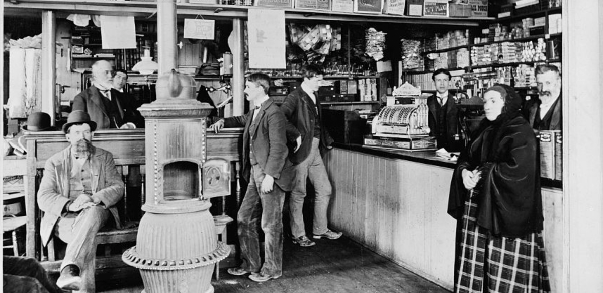
It’s important to note that in this context a font was a complete set of characters at a specific size and style. If you wanted a larger or smaller size of the same typeface, that was a different font and was a different purchase. Likewise, the italic or bold style of a typeface required a separate font. Being a collection of physical metal objects, fonts had to be sorted and stored. When a typesetter was to set a block of text, they organized the font in a large open boxes called type cases, with individual characters in their own separate cubbyholes. The majuscule characters were placed in an upper case, and the minuscule characters were in the lower case, which is where the terms uppercase and lowercase originated. (Other phases that come from moveable type include “mind your p’s and q’s,” referring to how easily the characters could be confused, especially since the metal type was in reverse; and “out of sorts,” which originally meant “lacking enough of a character to finish setting a page,” like when a typesetter ran out of E’s or ampersands. There are more!)

Flash forward to 1986 and the original Macintosh operating system. Macintoshes were the first inexpensive consumer computers that had proportional type (that is, letters that varied in width, unlike typewriters whose letters were all spaced the same). They also shipped with a variety of different typefaces built into the system; these could communicate with photostatic laser printers, which were also newly available to consumers and institutions at (relatively) low costs. The practical upshot of this was that text could be typeset and printed at the desktop level. While the printed text could be at any arbitrary size, the on-screen text had to be designed for the screen’s resolution. This required different description files for italics and boldface, as well as for each size: 9 point, 10 point, 12 point, etc. This division by typeface, style, and size was closely analogous to traditional cast metal fonts and so that’s what Apple called the files that stored this information.

As screens increased in resolution and CPUs increased in speed, eventually computers could resize text without needing separately sized files. But for a generation with no knowledge of fonts as anything but files on a computer, the name stuck, and neither Apple nor Microsoft, nor any third-party typeface designers, changed or clarified the file type. And so now “font” is synonymous with “typeface,” and in fact, few people who aren’t graphic designers even know what at typeface is.

And so it goes. Language always evolves, and people complain that words changing are being misused. The title of this essay is another example of this: many claim the phrase should be “fount of knowledge,” not “font,” because in this case we are talking about a fountain. It’s kind of silly. But as Ms. Mitchell sings, something’s lost and something’s gained. Sometimes we loose a bit of history, a bit of perspective, a distinction that goes beyond mere definition.

But, as I said at the start, I try not to be a smart ass. Some times I try harder than others.

A bad motivator

Lucas Vader

For the last couple of weeks there has been a great disturbance on the Internet, as if millions of geeks suddenly cried out in terror. I’m talking about the latest batch of changes George Lucas has made to his Star Wars movies, this time on the occasion of their blu-ray release. The long story short here is that ever since the “special edition” releases of the 1990s, Lucas has been altering the original three Star Wars films; sometimes substantially, with new scenes and actors swapped in digitally; sometimes trivially, with newer visual effects and bleeps and farts. This isn’t a bad thing in theory—directors’ cuts are usually greeted as definitive versions, and many artists can’t resist the urge to go back and tweak their earlier work. (Walt Whitman added poems to, subtracted poems from, and generally rewrote poems in every new edition of Leaves of Grass in his lifetime.)

But in the case of Lucas the changes to the original have been so awful, and the memories he’s tinkering with are held so dear, that it seems a kind of spite is driving him at this point. I’m not going to list the details of all the alterations here (that’s what Google’s for), but suffice it to say, it’s understandable that people might want to have available the original version of a film (and here I’m talking about the first, 1977 Star Wars) that holds such a central place in the history of film and society. But Lucas says no; this is his vision, you get it all—all retrofitted to mesh with the awful prequels—or you get nothing.

If the original film—now thirty-five years old—had been released under the original fourteen year copyright term (renewable once), this would all be moot. Criterion would be free to release a restored original version with commentary by historians. Wal-mart could release a budget version with all the incest taken out. And Lucas? Lucas would still be free to alter his films in any way he wanted to. He could stick Jar-Jar into every damn frame if he liked and all of the fans who valued his intent over their childhood memories (there must be at least four or five of them) would be free to purchase these enhanced versions. The point is, Art with a captial A would be served and Commerce with a capital ¢ would be served as well.

There are rights holders like Lucas whose bad dealings with the art they own comes from an honest belief that they’re doing what’s right. Then there are rights holders like Disney, who are motivated entirely by their desire to monetize their holdings as efficiently as possible. The famed “Disney Vault”—the practice of Disney of bringing properties in and out of print in cycles—is a good example of this. They aren’t doing this to benefit their films or their audience—they’re just making sure their products are not in competition with each other. Disney animation from the 30’s, 40’s, and 50’s is central to our cultural heritage, but we’re kept from it, not by the artists who actually produced it (they’re all gone) but by a marketing ploy. Similarly, Disney gets to remove any scenes or elements form its films that might affect their salability.

It’s not just pop culture that suffers from the heavy hand of rights holders: no less a luminary than James Joyce has also been affected. The current executor of this seminal Modernist, so central to world literature, is the artist’s grandson, Stephen Joyce. Under the name of protecting his grandfather’s legacy, the younger Joyce has aggressively hindered access to the artist’s letters: bringing suit (or threatening) against biographers and scholars whose work he deems harmful, prohibiting public performances of his grandfather’s work, destroying letters by Joyce’s daughter, and hoarding unpublished writings. He even said no to Kate Bush using Molly’s soliloquy in a song. Thankfully, the works of Joyce are about to enter the Public Domain—at the end of this year, only sixty years later than they should have.

Afterword: In the article on Joyce linked above, the author writes: “It is understandable and reasonable that the heirs of an author […] would gain a financial benefit for a certain time from that author’s work, in the same way that a descendant who has been left a farm or a house is entitled to a financial gain from it.” I note this because I think it’s a fallacy that’s often made to justify the passing of copyright to one’s heirs. The correct analogy would be that as a farmer may leave his farm and equipment to the next generation, so too an author may bequeath to their heirs their own tools of production: pens, paper, notes, typewriter or computer. An analog to copyright for the farmer would be if the farmer’s heirs continued to receive residuals on crops produced many decades before.