The new Coen Brothers film The Ballad of Buster Scruggs features an impressive cast, but for me the true star of this anthology is the prop book used to join these violent, nihilistic western stories together.

The book is presented as cloth-bound with an embossed cover. Cloth binding began in the 1820s and by the 1830s embossing was developed as well, leading to increasingly ornate treatments and eventually to foil-stamping. The understated, two-color printing marks this as a humbler work for a popular audience. I can’t place the typeface, but it looks quite a bit like Weiss (1928), which in turn was based on Italian Renaissance printer’s faces. The bold, simple design of the cover illustration brings to mind book designs from the 1910’s and 1920’s—a popular time for western literature, which had its major flowering of popularity with the publication of Owen Wister’s The Virginian (1902).
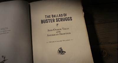
All of which makes it a bit surprising that the front matter dates the book to September, 1873. The decision seems to have been to locate the fictional book closer to the time the movie depicts, the 1840s (as referenced by the inclusion of stories of the Gold Rush and the Oregon Trail). But there are many details to the book which would make it an artifact of the turn of the century or even later. The barred “western” typeface used for the title here appears to be Barbaro Roman, a contemporary face mimicking Victorian sources. The type shows a slight embossing, which is the sign of letterpress, or movable type. But overall the title page “feels” contemporary rather than historic. The leading (space between lines of text) is much tighter than a 19th century source would be. The text is sized subtly as in the slightly smaller “THE BALLAD OF” and the slightly larger “BUSTER SCRUGGS”; an actual 19th century printer would not have such a collection of font sizes in metal, particularly for a display face.

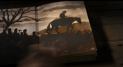
The color plates are the perhaps the most remarkable feature of the prop. Color lithography had been used to decorate letterpress books since the late 18th century, but it became more popular in the late 19th. These images had to be printed separately and were much more fragile than the letterpress pages, and so required protective sheets of onionskin or glassine to keep the ink from rubbing off. The illustrations in the prop book evoke the Brandywine School of illustration, named after the artists’ colony founded by Howard Pyle in 1895. It was to this school that illustrator N.C. Wyeth belonged, whose famous illustrations for Treasure Island (1911) and The Boy’s King Arthur (1922) set the tone for lush illustrations of adventure for decades to come. It’s these illustrations that would lead me to guess the book was a product of the 1910’s or the 1920’s if we were not given a “copyright.”
Even more anachronistic are the illustrated endpapers, rendered in a watercolor style that strikes me as more 1950’s or even 1960’s.

Lastly, I have nothing historical to say about the book’s dedication, except that I’m sure there’s a story here somewhere.


