On my office wall I have a framed type specimen that comes from a silkscreened portfolio of typefaces offered by the Stemple Foundry which I found discarded in a dumpster behind my apartment back in 1993. The previous owner had also thrown out a copy of the classic of pre-digital typography, Designing With Type; I can only assume that whomever had thrown them out did so in a fit of pique regarding the then-nascent desktop publishing revolution. Whatever the reason, these beautiful, oversized sheets have become a treasured possession of mine, and especially the one framed on my wall, of Hermann Zapf’s 1955 Optima, my favorite typeface.
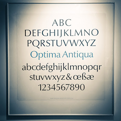
My framed specimen. In German, “Antiqua” is used as “Roman” is used in English when referring to a typeface.
Zapf turned to type design after working through World War II as a calligrapher, and his work is marked by delicate modulations in line width, such as come from pen lettering. His earlier masterwork, Palatino (1948), is technically an Old-Style typeface, but upon examination stems and bars show subtle tapers and flares, imitating the twist of a nib.

Palatino (1948)
Zaph’s calligraphic approach is all the more remarkable when viewed in the context of the dominant postwar International Typographic Style, whose famous neo-grotesque faces such as Univers or Helvetica were based on highly geometric, uniformly-weighted forms that eschewed decoration or beauty for beauty’s sake. In the midst of an increasingly homogenious, neutral, mathematical design, Zaph struck upon the idea of a sans-serif typeface that had the proportions and weight of a humanist hand, inspired by ancient Roman lettering he saw at the cemetery of the Basilica di Santa Croce in Florence.
Released in the mid-1950s, Optima had its greatest popularity in the 1970s, when it became a favorite for package design, particularly cosmetics; and also for building signage. For those of us of a certain age, who snuck a peek into our parents’ bedroom, it’s probably best known as “the Joy of Sex font.” The slender, gently tapering strokes do have a sensual, vital feeling, particularly when close and overlapping, as in the book’s original title setting.
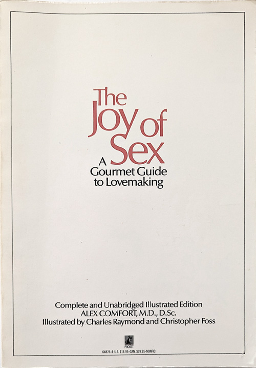
The Joy of Sex, 1972
For me personally, Optima was the typeface of information and science. It popped up in medical, psychological, how-to, and self-help books. Most importantly, Optima was used in the 1972 textbook, Biology Today. This crazy book was ostensibly a first-year college biology textbook, but its psychedelic (and sexually graphic) illustrations combined with a strongly humanist worldview to create an incredible moment of crossover between the counterculture and natural science.

Diagram from the 1972 edition of Biology Today, employing Optima.
Please visit this link for highlights from this strange and wonderful book.
Since the 80s Optima’s popularity has waned, although its glyphic origins in Roman lettering have given it a place as the go-to letterform for incised or etched text when you’re trying not to use Trajan. The Vietnam Veterans Memorial’s names are etched in the typeface, as are the names of the lost at the National 9/11 Memorial pools. But present-day tastemakers such as Erik Spiekermann dismiss Optima as “tired & inappropriate.” In the age of the web, the cool mathematical typography of the International Style is championed, particularly Helvetica and Univers. I suspect it has much to do with the limitations of fonts produced by pixels.
As for me, my love of Optima is undimmed by vagaries of taste. In 2011 I was the graphic designer for the exhibition Dura-Europos: Crossroads of Antiquity, which featured archeological finds from the Roman city destroyed in 254 whose remains are in present-day Syria, and I was delighted to set the catalog and exhibition graphics in this timeless face, bringing Zapf’s inspiration full-circle.

Design by the author.