Strangely enough for a podcaster whose whole deal is revisiting high school assigned reading, very little of the plot of J.D. Salinger’s The Catcher in the Rye (1951) sticks in my memory. I know it involved a lot of wandering through the seedier parts of New York City, and that there was a lot of stuff about how phony adults are. There is one passage, though, that I remember clearly and think about often: a section where the novel’s runaway teen protagonist, Holden Caulfield, reflects on the enduring appeal of visits to the American Museum of Natural History. In particular, he describes the life-sized dioramas that—in his mind, at least—never change:
The best thing, though, in that museum was that everything always stayed right where it was. Nobody’d move. You could go there a hundred thousand times, and that Eskimo would still be just finished catching those two fish, the birds would still be on their way south, the deers would still be drinking out of that water hole, with their pretty antlers and they’re pretty, skinny legs, and that squaw with the naked bosom would still be weaving that same blanket. Nobody’s be different. The only thing that would be different would be you.
In this passage, Holden is seemingly describing an actual diorama that was on display in the AMNH when Salinger wrote the book: a depiction of an Inuit woman ice fishing1. The scene has been preserved in a guidebook photograph from 1911:

But in spite of Holden’s prediction of the display lasting “a hundred thousand” visits, just four years after the publication of The Catcher in the Rye the AMNH had replaced that diorama with another, reflecting the changing ethnography of the time:
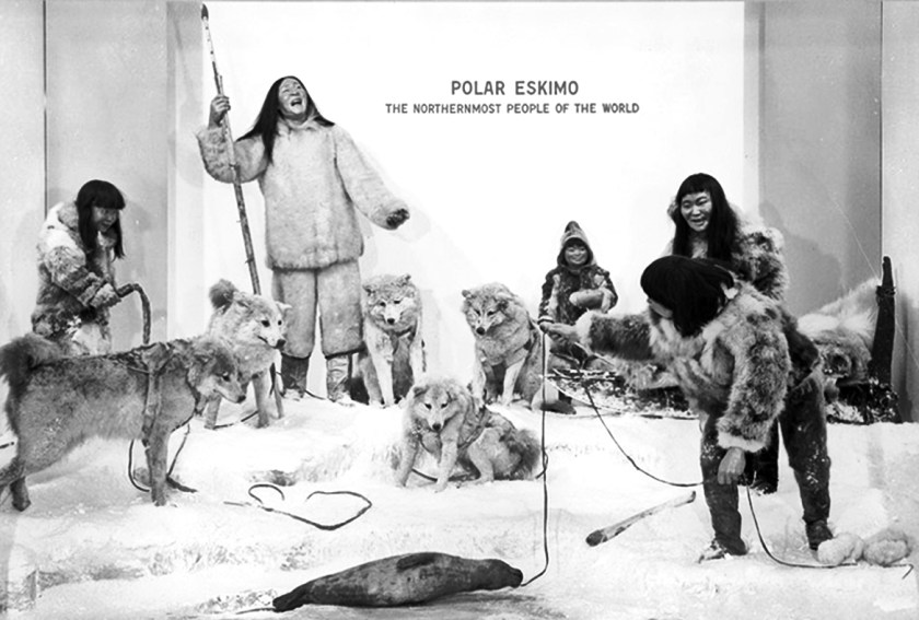
Today, of course, neither of these dioramas are still installed, and the term “Eskimo” is considered both overly vague and possibly offensive. Arctic natives are now referred to by their nation names of Innuit or Yupik.
Exonyms aside, in this passage Holden expresses a common assumption: that museums are by definition static, fixed in time, and that the objects they display are and will always be definitive. For some, like Holden, this seeming changelessness is a source of comfort. Others may find the idea petrifying or morbid. For example, Bruce Dickinson of the heavy metal band Iron Maiden has criticized Cleveland’s Rock and Roll Hall of Fame, claiming “Rock and roll music does not belong in a mausoleum […] It’s a living, breathing thing, and if you put it in a museum, then it’s dead.”
Pro or con, immutability is implicit in both Holden’s and Dickinson’s words. But in fact, Museums are in constant flux. Sometimes changes are little. When I was in graduate school in Art History, the nautical artist currently known as Fitz Henry Lane was called Fitz “Hugh” Lane. While art museums everywhere (inluding the Fitz Henry Lane House) have corrected their attributions, I still find myself using the old name out of habit2. Some changes are enormous changes. When I visited the AMNH myself as a young child, the Roosevelt Hall—the grand entryway from Central Park West—did not feature its current display of mounted Barosaurus and Allosaurus skeletons battling. Instead it had a series of bronze statues of Nandi warriors hunting lions3, and the dinosaurs it did have on display on the fourth floor were still walking upright and dragging their tails behind them. And, of course, the most famous dinosaur on display then was the Brontosaurus. The skeleton was one of the first excavated by Earl Douglass at the fossil deposit that would be designated Dinosaur National Monument. I had a toy Brontosaurus that we bought at the museum; it was a mainstay of my childhood, although the tail eventually got chewed away by the dog. And by me.

But as you probably know4, this skeleton was in fact a frankenfossil, an Apatosaurus whose missing skull was replaced with one from a Camarasaurus. When the skeleton was re-mounted in the 1990s to reflect new beliefs about the posture of dinosaurs (no more dragging tails) it was re-labeled as an Apatosaurus. Brontosauri were, in fact, no longer considered a genus. Except in 2015 they suddenly were real again. As Ramona Flowers put it, “Dude…”
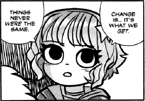
(Warning: Politics) Recently I’ve been thinking about Holden’s dioramas a lot these days in relation to the complaints President Tump has made regarding the Smithsonian Institution’s collections and exhibitions. Putting aside issues of the legality or propriety of the Administration attempting to set policy for an institution that is supposed to be independent of any branch of government, this the culture-wars approach to museums seems to me to be related to the assumption that museums are, or should be, the caretakers of singular, true and timeless narratives.
Museums should, and do, take their role as authorities of truth—or at least, of cultural significance—seriously. Non-specialists visit these institutions in part because they trust curators to know their stuff. Visitors want to be guided through subjects they care about but of which they know little. But curators, conservators, registrars, and others who do know a lot have are also aware of how knowledge is never complete. They design exhibitions to reflect the current state of scholarship, and scholarship—in both the sciences and in the humanities—is constantly questioning and re-evaluating what we think, and asking what has been overlooked, and what assumptions got us here. Truth isn’t a matter of supporting a specific set of beliefs, and the stories we tell—even about ourselves—change the more we know. (end politics)
Nonetheless, I get what Holden is on about. As this blog has documented again and again, I’m full of misplaced nostalgia, and that can express itself as a general aversion to change. I think I have the most nostalgia for things that I wasn’t even around for the first time. As a child, I would visit Youngstown, Ohio’s Mill Creek Park. This park had a nature center that was housed in a 19th Century stone building, and within this was a display of old museum objects, including a shelf full of small animals and plants preserved in large jars of formaldehyde, with their contents written on peeling gum labels in a shaky copperplate script.

These jars both fascinated and horrified me, and they gave me a lifelong love for Victorian and Edwardian museology—stiff taxidermy, dovetail jointed display cases, hang tags, and all the rest. They represent a time when knowledge consisted entirely of collecting, categorizing, and cataloguing. I don’t know if these jars are still on display, but the fear that they may no longer be has kept me from revisiting the park as an adult5.

My favorite archaic museum exhibit, however, is Mathematica: A World of Numbers… and Beyond. Created by the wonder couple Charles and Ray Eames in 1961, one of the traveling versions of the exhibition is still somehow improbably on display at Boston’s Museum of Science in this, the year of our Lord 2025. This wonder of Mid-Century design could just as well be housed in an art museum. It drips with the charm of 1950’s typography, pastiches of Victorian broadsheet design, and cool, elegant physical objects demonstrating probability, topography, and number theory. A highlight are the “peep show” videos that accompany the exhibition. Here are a few:
Maybe it’s the sheer artfulness of this exhibition that has convinced the Museum of Science to continue to devote to a portion of limited floorspace to its presentation. It could also be that the subject of Mathematica is seen as pretty permanently fixed. But even mathematics changes, and perhaps one day this exhibition will also find its Brontosaurus.
I’m not sure what Holden would make of this essay. Like many of my posts, it sort of chugs along and then stops when I run out of things to say. I guess I hope he would understand that nothing is ever the final word—not museums, not scholarship, and certainly not blogs.
- Holden says that the figure is a man, but Holden is wrong about a lot of things. ↩︎
- I also still haven’t heard a convincing explanation as to why it was “Hugh” in the first place. ↩︎
- These statues, by taxidermist and big game hunter Carl Akeley (or perhaps a separate set of bronze castings), are still housed in Chicago’s Field Museum. ↩︎
- Being the kind of nerd that reads my blog. ↩︎
- Well, that and having to travel to Youngstown. ↩︎


