Know Your Typefaces: Optima

Optima

On my office wall I have a framed type specimen that comes from a silkscreened portfolio of typefaces offered by the Stemple Foundry which I found discarded in a dumpster behind my apartment back in 1993. The previous owner had also thrown out a copy of the classic of pre-digital typography, Designing With Type; I can only assume that whomever had thrown them out did so in a fit of pique regarding the then-nascent desktop publishing revolution. Whatever the reason, these beautiful, oversized sheets have become a treasured possession of mine, and especially the one framed on my wall, of Hermann Zapf’s 1955 Optima, my favorite typeface.
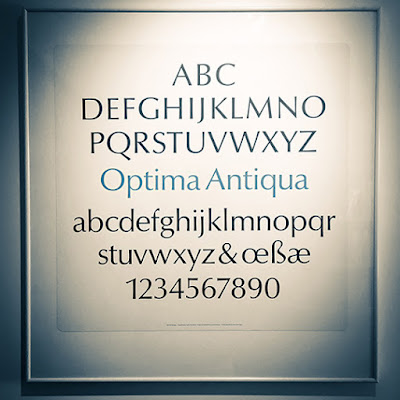
My framed specimen. In German, “Antiqua” is used as “Roman” is used in English when referring to a typeface.

Zapf turned to type design after working through World War II as a calligrapher, and his work is marked by delicate modulations in line width, such as come from pen lettering. His earlier masterwork, Palatino (1948), is technically an Old-Style typeface, but upon examination stems and bars show subtle tapers and flares, imitating the twist of a nib.

Palatino (1948)

Zaph’s calligraphic approach is all the more remarkable when viewed in the context of the dominant postwar International Typographic Style, whose famous neo-grotesque faces such as Univers or Helvetica were based on highly geometric, uniformly-weighted forms that eschewed decoration or beauty for beauty’s sake. In the midst of an increasingly homogenious, neutral, mathematical design, Zaph struck upon the idea of a sans-serif typeface that had the proportions and weight of a humanist hand, inspired by ancient Roman lettering he saw at the cemetery of the Basilica di Santa Croce in Florence.

Released in the mid-1950s, Optima had its greatest popularity in the 1970s, when it became a favorite for package design, particularly cosmetics; and also for building signage. For those of us of a certain age, who snuck a peek into our parents’ bedroom, it’s probably best known as “the Joy of Sex font.” The slender, gently tapering strokes do have a sensual, vital feeling, particularly when close and overlapping, as in the book’s original title setting.
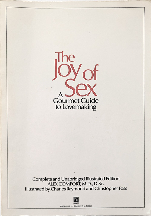
The Joy of Sex, 1972

For me personally, Optima was the typeface of information and science. It popped up in medical, psychological, how-to, and self-help books. Most importantly, Optima was used in the 1972 textbook, Biology Today. This crazy book was ostensibly a first-year college biology textbook, but its psychedelic (and sexually graphic) illustrations combined with a strongly humanist worldview to create an incredible moment of crossover between the counterculture and natural science.

Biology Today

Diagram from the 1972 edition of Biology Today, employing Optima.
Please visit this link for highlights from this strange and wonderful book.

Since the 80s Optima’s popularity has waned, although its glyphic origins in Roman lettering have given it a place as the go-to letterform for incised or etched text when you’re trying not to use Trajan. The Vietnam Veterans Memorial’s names are etched in the typeface, as are the names of the lost at the National 9/11 Memorial pools. But present-day tastemakers such as Erik Spiekermann dismiss Optima as “tired & inappropriate.” In the age of the web, the cool mathematical typography of the International Style is championed, particularly Helvetica and Univers. I suspect it has much to do with the limitations of fonts produced by pixels.

As for me, my love of Optima is undimmed by vagaries of taste. In 2011 I was the graphic designer for the exhibition Dura-Europos: Crossroads of Antiquity, which featured archeological finds from the Roman city destroyed in 254 whose remains are in present-day Syria, and I was delighted to set the catalog and exhibition graphics in this timeless face, bringing Zapf’s inspiration full-circle.

Design by the author.
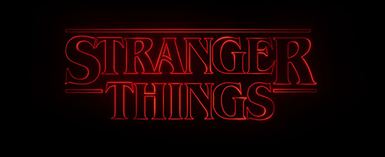
Know Your Typefaces: ITC Benguiat

Netflix’s Stranger Things firmly displays its retro intentions by using International Typeface Corporation’s Benguiat, a face by Ed Benguiat that was released in 1978. Although obviously inspired by Art Nouveau typography, Benguiat was very much a product of its time and of ITC, with its typically large x-height (the height of a lowercase “x” when compared to a capital) and the bold contrast between thick and thin strokes.

ITC Benguiat Bold (1978)

It’s informative to look at Benguiat in comparison with a well-known Art Nouveau typeface, Desdemona (1886), from which it cribs a few features, including the upward slanting bowls of the P and the R; the high beams of the E, F, and H; and how the slanted beam of the N connects two-thirds of the way down the right stem. But true Nouveau fonts would never have the extreme stroke variation of Benguiat, as they drew their inspiration from vegetal forms.

Desdemona Black (1886)

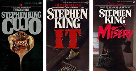
The bold readability of Benguiat and its wiff of nostalgia made it a particular favorite for paperback designers of the early-to-mid 1980s, where it displaced fussier, swash-serifed and flourish-heavy faces like Tiffany (1974) (also designed by Ed Benguiat). The simple, wedge serifs were well-suited to embossed titles, which were becoming the vogue, especially for genre fiction such as romance, sci-fi, and horror. Bespoke hand-drawn adaptations of the face eventually became the standard setting for Stephen King’s name in Signet paperback editions and it’s these books that the producers of Stranger Things specifically want to evoke.

Signet King paperbacks showing letterform variation

While researching Benguiat I was struck by the variation I found in the treatment of King’s name on paperback covers. Before desktop publishing, there was no simple way to manipulate letterforms and designers had to draft logos by hand, particularly if they wanted the letter block set close or to add a flair to a serif or swash. This meant long hours with a set of French curves, and I can actually remember as a baby designer back in the late 80s designing some titles this way. I doubt I still could.


Typefaces by Ed Benguiat
Benguiat had a long career at ITC and was responsible for many of its signature faces.

Horror Books of the 1980s
This collection by Will Erikson shows how ubiquitous Benguiat was (Thanks to Phil Gonzales for the link).

Another blog entry about the same thing
After I wrote this I was pointed to this essay by Ryan Britt on Inverse.

Benguiat is also the typeface for the Smiths’ Strangeways Here We Come.

Give us those nice bright colors, give us the greens of summer

Holiday Inn

By now you’ve had a little time to make your peace with the new Instagram icon. In the accelerated, media-savvy world of Internet 2.0 (or whatever release number we’re on), there have been already been critical essays on how bad the redesign is (for an example, see this Adweek piece) and a backlash about how old farts just hate change of any sort (for an example, see the comments section of the Adweek piece). Instagram themselves shared a statement about the change, with the usual design-speak explanation that skeuomorphism is old news, that the icon is a doorway into the app and that the app GUI is tailored to the way users use the lightweight photo-manipulation / sharing system.

Insta

For me, the rationale is depressingly predictable. In the mobile scene, the clinical eye of Jonny Ive has cast its gaze over everything, and we’re told that all users want is an interface that gets out of the way and disappears entirely into a mist of flat gradients and semi-transparencies. Never mind that bright colors and heavily-stroked geometric forms are as invisible as traffic signs—which are, after all, brightly-colored, heavily-stroked geometric forms—in about five years they are going to be as dated as 90s’ bevels and drop shadows.

But I get that Instagram wants to move on. When it first launched (only four years ago) it was known primarily for its filters, which gave a patina of vintage charm to the most ephemeral of digital productions, the smart phone photograph. Instagram was adopted by the hipsters, who delighted in making their locally-sourced artisanal breakfast sandwich look as though it had been photographed in 1973 by a Poloraid Land camera, or as though that afternoon’s thrift-shop find had been kicking around since 1932, as evidenced by the sepia tone of this faux silver print. Of course, everyone hates hipsters, especially hipsters, and Instagram was snapped up by Facebook, which means it’s time to move on and embrace a more generic identity.

But what’s lost in the rebranding is the sense of play. Social media platforms operate on one level as convenient publishing systems for nonspecialists to share information, but on another level they are games whose rules become defined by their user base. Tumblr is technically a lightweight blog platform, but its character comes from the community drawn to it, whose users have developed a protocol for the correct way to appropriate media and repost it. Snapchat’s character arises from the community’s interest in intimacy and immediacy. Twitter is where everyone wants to be the most clever. For its brief life, Instagram’s quirks (square photos, obvious filters) have combined with urbane hipster tastes to encourage an aesthete’s view of the world: photos of alleyways, wrought-iron fences, graffiti on brick walls. No doubt Facebook wants users of all stripes to embrace the application, and your aunt and uncle may have no use for another picture of a manhole cover, but they might consider dropping $40 on a photo book of baby pics.

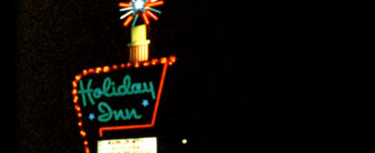
Still, I had a lot of fondness for the Instagram camera icon. In the iPhone’s sea of flat infographics, it was the one hold-out for charm and play. It was sort of oddball, it was sort of ugly. Mostly, it was distinctive, and that loss of distinction is the saddest part. When I was a child, the Holiday Inn “Great Signs” still dotted highways in the midwest. Incongruous and garish, they spoke to the past futurism of the Atomic Age. I remember looking for them on the horizon under the stars during family road trips. They were weird, they were unique. And when at last Holiday Inn decided to replace them, they went for the most bland, most uninteresting alternative. No child would search the night sky for that sign. And no one will pause and smile before tapping the new Instagram icon.

Great sign
Not great logo