Butcher one’s own Hartebeest using only a penknife and pocket-comb
Hand-roll the perfect cigar; place in a Lucite case to be smoked upon one’s deathbed
Master the art of single-tear cry
Master the art of removing a front-clasp bra with one’s toes
Learn to make the deadliest cocktail, the Dank and Steamy
Serve a Dank and Steamy to Norman Mailer’s ghost
Defend a lady friend’s honor by employing a rear naked choke
Learn the difference between a fedora and a trilby
And also a homburg, why not
Spend at least one year’s salary on a bottle of Scotch
Put one’s faithful dog of twenty-three years down, but only after staring long into its eyes and reaching an understanding
Write an essay on euthanizing the dog and sell it to the Paris Review
Learn how to say “humidor” in twelve languages
Climb every mountain, ford every stream; but you know, in a manly way, not the way that a nun would
Locate and purchase the car in which you were conceived
Rebuild transmission of said car
and present it to your dying father as a gift upon the anniversary of your mother’s death
Sit a while in absolute silence in the passenger seat as your father runs his trembling, spotted hands over the walnut burl dashboard before switching on the radio
Listen to “Reeling in the Years”
Wait, that might be a little too on the nose, let’s make that “My Old School”
Upon the death of your father, drink the bottle of Scotch in a single sitting and crash the car into the first tree you successfully climbed as a child
Fix car and sell on EBay for a profit
Learn to express one’s feelings by not saying or doing anything
Mary: Deah Mathyew, I hev so enjoyed our supernatural meetings these strange nights, but somehow I feel we must draw the curtain on these séances, as it were. It’s only that yew hev shuffled off this mortal coil some four yeahs ago, and in the meantime I went and married a motorist—I believe his name is Henry or Heathcliff or something of the sort—in any case I hev also had my dalliances with Gilly and Tony—what I’m sayin’, Mathyew, is I hev had a fair amount of tail in your absence, and perhaps the time has come for us both to move on.
Matt: Oh Mary, yew old thing, I know all about it; For hev I not watched over yew these many nights, creepin’ in through the wainscoting and such, peepin’ in as yew—
Mary: Steady on, Mathyew, can’t a widow hev a bit of privacy?
Matt: Mary, old bean, we on this side of the spiritual veil are not full of your hang-ups, man. As for me, I hev been dallyin’ with your dear sister Sybbie on the reg—
Mary: Good Golly! [blushes becomingly]
Matt: —and yet there is something to what yew say, for I too feel we hev arrived at an ending, don’t yew know, and after so many Sunday evenings together we shall need to find something else to do.
Mary: I suppose I felt it when Edith [spits] announced her engagement. Suddenly it seems everyone was getting married: our cranky butler and that Scotswoman, the mousey cook and the strapping young footman [pauses to imagine Andrew in his undershirt] and even your unlovable old mater has found connubial bliss, as it were. Why I do believe our little George has proposed an engagement to Sybbie junior, and he cannot yet pronounce his R’s. It seems as though good times hev come to us all, and all is well as ends well, wot? I suppose I shall switch to watching Poldark [pauses to imagine a shirtless Aiden Turner].
Matt: Well then Mary, I must bid yew and your eyebrows adieu! Only one thing left to say, and, well, I hate to mention it—
Mary: What, my phantasmal lover?
Matt: Only now that Edith is a marchioness, she can, in fact, hev yew beheaded.
In the glamorous world of Web Design, 95% of time with clients is spent discussing the same two or three basic points about image size, so I’ve attempted to write up a short set of answers to which I could point them. I have tried to be brief and funny, but also useful. I’ve also tried to keep my tone free from the exasperation I often feel when going over these points for the third time in a day. Graphic designers out there, tell me what points I’ve missed and where I could be clearer. If you want to use this as a reference in your own correspondence please do.
How big should my image be?
Short answer: 1000 pixels on its longer side. PNG or possibly JPG and less than 1 MB file size. Long answer: see below.
Why is this image “too small?” It’s 300 dpi!
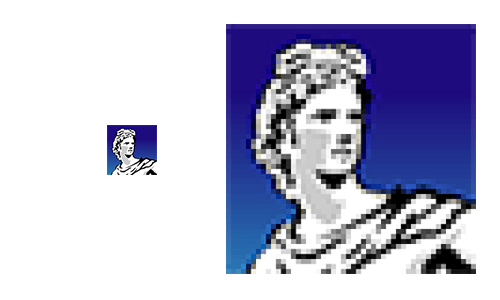
In print, the magic standard is 300 dpi, meaning that an image has three hundred pixels per inch at the size it will be reproduced. If your image is 300 dpi but only one inch wide, and you want to fill a double-page spread with the image, it will have to be blown up to seventeen inches and all those tiny pixels will be seventeen times as large so now your image is effectively seventeen and a half dpi.
On the web, dpi is meaningless, because you might be looking at an image on your grandma’s ’95 Gateway or on next year’s Apple Watch: you have no idea what size those pixels are. It’s more important to think about how many pixels wide and high an image is so that the designer can think of the amount of space in a window it will occupy.
A nominally high-resolution image becomes low-resolution when presented at a different size
Zoom to enhance?
You can’t reveal detail that isn’t there. An image that is out of focus or noisy will be more out of focus or noisy when blown up. If the image has sharp lines, like the edges of letters, those will degrade. If you have an image of an old newspaper, you will need to capture all the detail you want at the photography/digitization stage. Words are a special case. People notice blurry letters much more than they notice blurry photos. So if you are digitizing anything you want your viewers to read, crank up the resolution on your scanner.
I compressed it! Aren’t you proud of me?
There are lots of ways image encoding systems save disk space. Some take advantage of redundancy in the data and don’t affect the way an image looks. Some take advantage of the way the human eye works and these can mess with the quality of an image. The biggest offender here is JPEG compression. This system uses a complex mix of math and psychology to trick the eye into seeing more detail than the file contains. But if you compress things too much the image will degrade, becoming jagged or spotty. This is particularly true of images with sharp lines (like text) or flat colors (like cartoons). For these images, PNG is a better format.
While JPEG compression can save disk space, its flaws are particularly evident with hard-edges and flat colors.
What about bit depth?
Bit depth is a measure of how many different hues an image can have. In theory, the more bits, the more discreet colors are available. In practice, people really can’t perceive the subtleties after a while. There are those who claim there’s a huge difference between 8 bits and 16 bits per channel. Those people are lying and they have too many figurines on their desks.
Is there anything else I should know?
There’s a ton of other stuff to know about digital images, from alpha channels to color spaces. Do you need to know these things? Are you a graphic designer? Then the answer is no. Ultimately the most important stuff is not technical. Is it a good photo? Is it in focus? Does it have white whites and black blacks? Is it not too grainy? Is it grainy enough? Do you like it?