

Previously:
Know Your Typefaces: ITC Benguiat
Know Your Typefaces: Optima
Type either comes with a history or it makes its own. Some typefaces, such as Garamond or Baskerville, are modern interpretations of alphabets by historic designers of metal type (e.g. 16th century Parisian Claude Garamond (c. 1510–1561), and 18th century Brummie, John Baskerville (1707–1775)). But other typefaces look not to specific past models but instead are derived more broadly from the traditional ways text is drawn or inscribed. Two display typefaces that were ubiquitous in midcentury book design, Albertus and Lydian, are of this latter sort. Published almost contemporaneously, and having many similarities including their weights, thick and thin variance, and x-height, they were the product of designers on either side of the Atlantic and drew inspiration from two very different ways of forming letters.
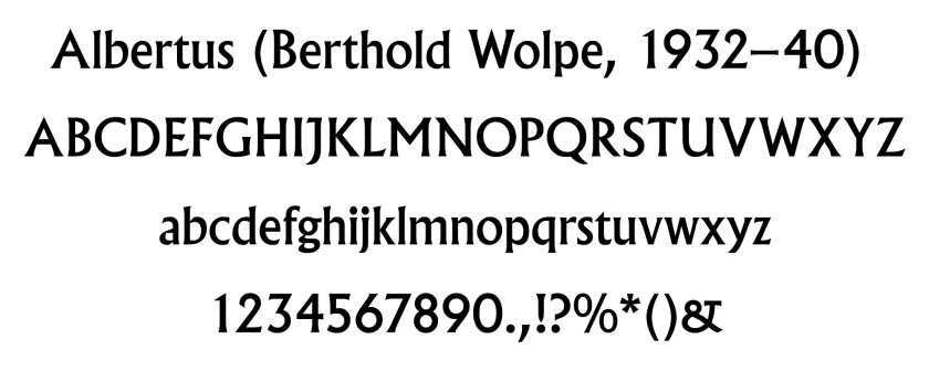
Albertus is the most famous face by typographer Berthold Wolpe. Wolpe was born in Germany but emigrated to England to escape the Nazis. While visiting London, Wolpe was invited to produce an all-capital alphabet for the Monotype corporation. Beginning in 1932, the majuscule version was first published in 1935; he later enlarged it to include minuscule letters in 1940. Amongst his many skills, Wolpe was an engraver, and he designed Albertus to resemble text carved with a chisel. In doing so, he was referencing some of the oldest Roman lettering still existing; the Humanist typographers who cut some of the earliest movable type had also looked to ancient stone letterforms for inspiration.
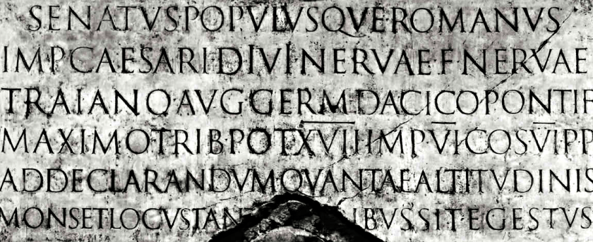
Wolpe’s background was specifically in engraving metal, but all glyphic (carved) letterforms share distinctive characteristics. Chisels produce small flared cuts at the start and terminus of strokes, and incorporating these into the design is the origin of serifs. Albertus’s serifs are quite subtle, blending into the thick-thin variation of the strokes.
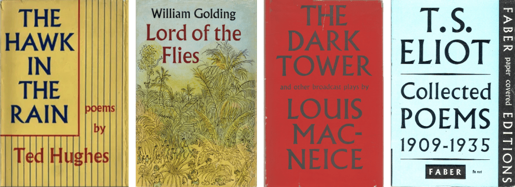
Wolpe was a designer for the British publishing house Faber and Faber from 1941 until 1975, where he designed over 1500 covers. He used Albertus on many of these; in most cases he drew the titles by hand, leading to variations in width and ornamentation. Even today, many decades after Wolpe’s death, Albertus continues its long history with the publisher.
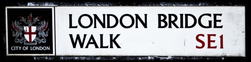
Beyond its use in book design, Albertus has been used in London street signage starting in 1988. For a fascinating discussion of the history of Albertus and other typographical features of London, I recommend Glenn Fleishman’s short book, London Kerning, available as a PDF on his website.
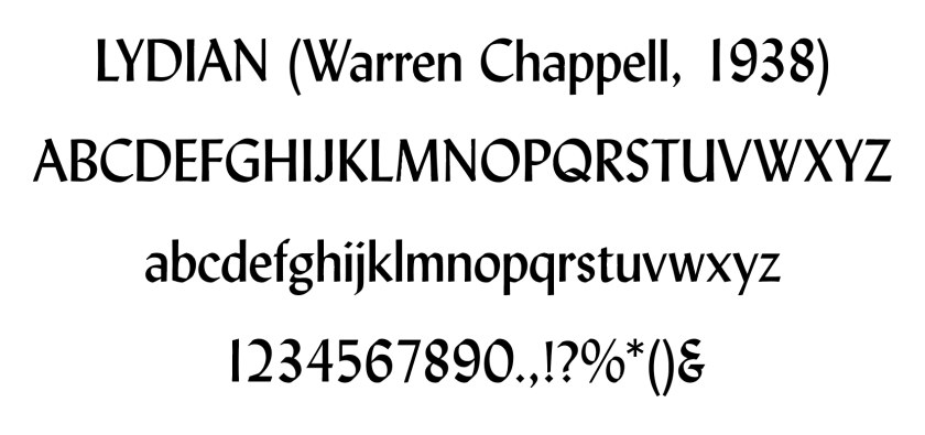
On the other side of the pond at almost the same time, designer Warren Chappell produced the Lydian typeface, published by American Type Founders in 1938. In architecture, “Lydian” refers to an ancient building style from the western Anatolian region of Lydia. In music, “Lydian” is a mode where the scale is based not on the first degree (solfège do) but on fourth degree (solfège fa). Knowing this, the underwhelming reason that Chapell chose the monicker for his typeface is that his his wife’s name was Lydia.
If one squints at specimens of Lydian and Albertus, they seem remarkably similar in their weights and base forms. However, where Wolpe based his design on engraving, Warren emulated the handwritten form, specifically calligraphy using a steel brush nib.

While some calligraphic hands are formed with flexible nibs (such as a crow quill) that produce wider lines when the writer presses harder on the ground, steel brushes make a consistently wide line when drawn one direction and a thin line when drawn the other way. The characteristic thick-thin of many hands comes from holding the nib at a forty-five degree angle.
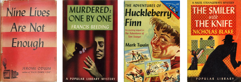
In the 40s and 50s, Lydian became widely used in American book design, especially in the exploding field of mass market paperbacks, where it was equally at home in titles for classics, mysteries, and science fiction. Both Albertus and Lydian found synergy with the emerging technology of phototypesetting, a new method for transferring designs photographically to film for use with offset lithography. Since metal fonts were no longer required, letterforms were no longer constrained by limitations of storage or broken type.
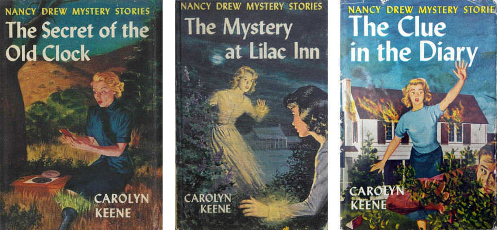
For many Boomers and Gen-Xers, though, the most memorable use of Lydian was as the “Nancy Drew font.” The Nancy Drew series, begun in 1930, got a makeover in the 1950s with new cover and interior art, and these were unified by titles in Lydian. In 1962 the series was redesigned again into the format most remember, the yellow-spined editions with artwork printed on the cover boards. These books used a variety of typefaces, but many continued to employ Lydian.
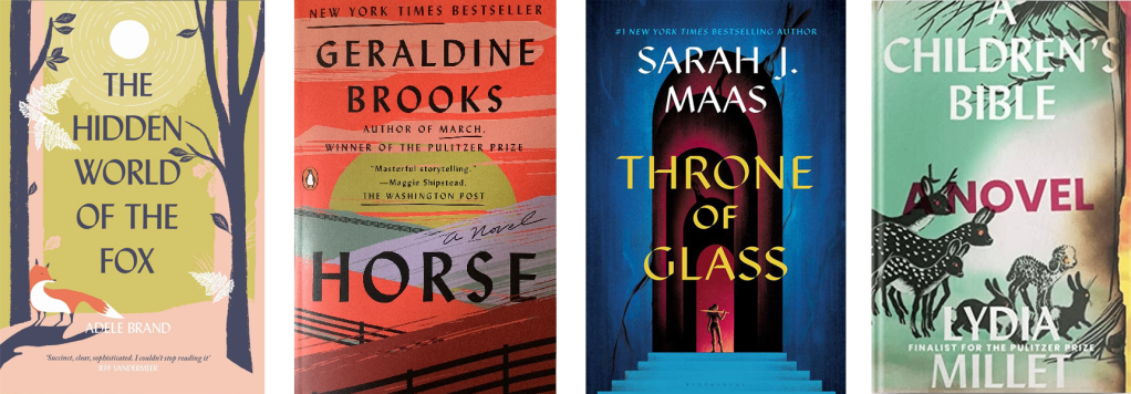
In recent years Lydian has seen a considerable revival in book design, particularly in covers for fiction, and particularly in designs that place the typography front-and-center. The handwritten, old-style letters provide a stark contrast to type made for reading onscreen, and Lydian’s long history in books creates a ready-made nostalgic and “literary” feel. It’s precisely these associations that I was thinking of when I used Lydian as the font for my Sophomore Lit podcast art.
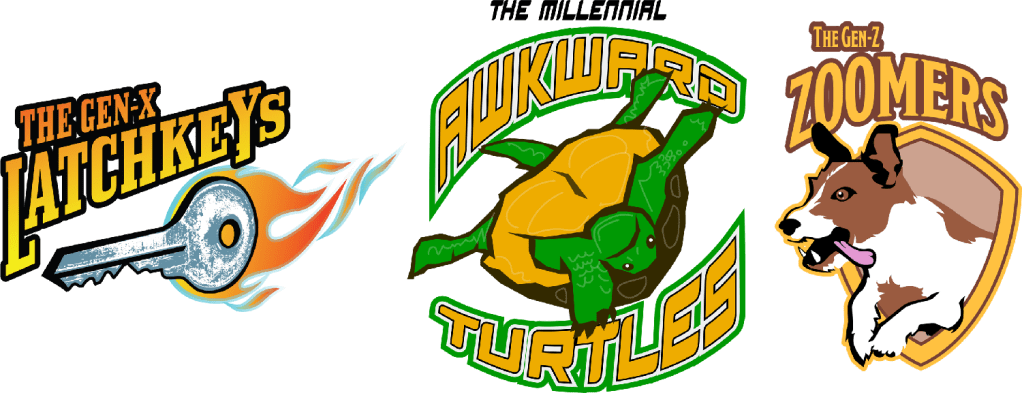
Bonus self-promotion: Speaking of my design, I now have a Redbubble shop, where you can purchase a Sophomore Lit mug, or any of a number of silly designs on clothing, mugs, stickers, and other things, including the Intergenerational Sportsball League line, which imagines the generations as sports logos. Please take a look!


Our overlap is really weird.
I also love Lydian!
I was friends with Toby Wolpe, Berthold’s youngest, who sadly passed in his 60s from cancer just last year.
LikeLike
You were ahead of the curve on Lydian. No similar resurgence for Albertus?
LikeLike